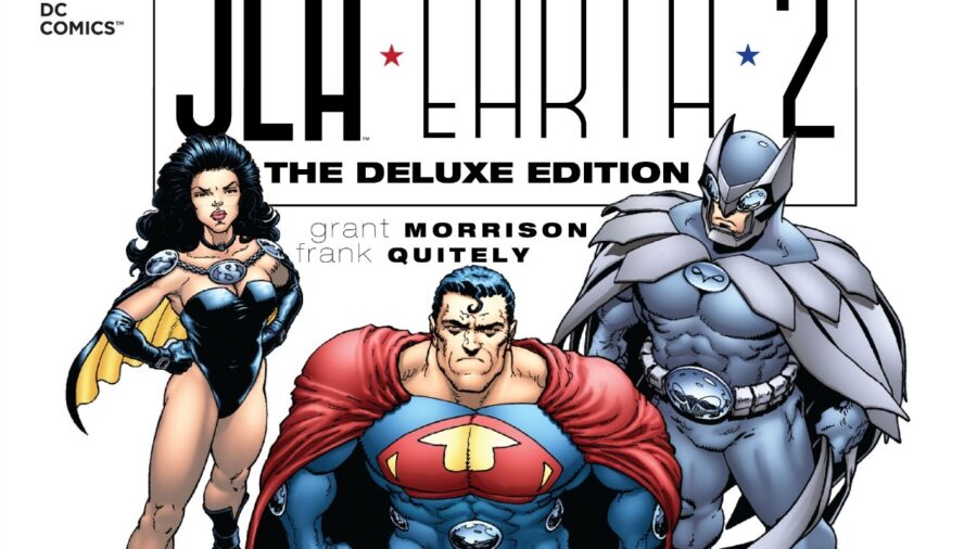
Review- JLA- Earth 2 A Tale of Dark Reflections
Review – JLA: Earth 2 Publisher: DC Comics Writers: Grant Morrison Artists: Frank Quitely Colourists: Laura DePuy Letterer: Kenny Lopez Release Date: 2000 Intro When you think of the Justice league, you think capes, cowls and most importantly heroes. So what happens when you take these beloved characters and twist them into something different, perverted even? You get Grant Morrison’s and Frank Quitely’s ‘JLA: Earth 2’. The premise of the book by the incomparable Scottish duo sees the Justice League face their greatest threat. Their own reflections. Morrison offers up a deliciously interesting take on what it means to be good or Evil. As no matter how good you are you will always have a perverted reflection that is worse. Plot ‘JLA: Earth 2’ tells the tale of an earth not dissimilar to our own except ruled by the Tyrannical ‘Crime Syndicate’. Composed of Ultraman, Owlman, Power Ring, Johnny Quick and Superwoman they rule their ‘Antimatter’ Earth unopposed. That is until the arrival of Superman, Batman and most of the Justice League. Who sent on a mission by an unlikely Ally, attempt to free the world from these villains forever. Writing The opening for ‘JLA: Earth 2’ starts as you would expect many early 2000’s Justice League story’s to begin. With a sweeping full-page splash of the JLA’s Moon base the ‘Watch Tower’. However, from within the first two pages it is established that something isn’t right. With a group of Shadowy figures discussing the situation of an escaped prisoner. The final panel of the second page is a close up of a familiar cape bearing a giant ‘U’. This sets up the book within the first view pages establishing the unfamiliar nature of the world and its inhabitants. Morrison is an expert storyteller, creating a world that is uniquely identifiable but still built on the normal DC universe. The concepts used in this book such as a Lex Luthor being a hero or an evil force invading from another Earth have become part of some of the best DC stories. Morrison’s version of the Crime Syndicate has also gone on to influence other itterations of the villians including in the brand new Crime Syndicate Book spinning out of Infinite Frontier. CSA Vs JSA I’m going to spoil some key character moments in this section so spoilers ahead. Morrison does an expert job extracting the key aspects of each hero and contorting them into darkness. First up Is Owlman who is the ‘dark reflection’ of Batman. It’s fair to say he is psychotic.The fact he’s Bruce Wayne’s brother on ‘The Antimatter’ Earth who witnessed his brother and mother be shot dead, probably doesn’t help his mental state. In his first appearance he murders a bunch of Gotham policemen all in the spirt of tormenting his father who is commissioner of GCPD on this earth. Owlman is intelligent and manipulative, being the brains behind the syndicate and the first one to figure out what is going on with the Justice League. He is also having an affair with Superwoman as its revealed later on he has black mail on Ultraman. Speaking of Ultarman, he is the pumped-up jock in comparison to Superman’s Small town boy. Ultraman is basically what would happen if you gave the bully at school superpowers. Whilst Superman understands the weight and responsibility of his power, Ultraman Revels in it saying, ‘There is no such thing as partial success’. Soon after annihilating a Civilian who speaks out against him. Ultraman is greedy and the reference I made to being a pumped-up jock is not me being hyperbole. His powers isn’t from his alien physiology like Superman but Anti-Kryptonite, a drug he takes in order as Wonder Woman says it: ‘The stuff you need to Keep you Ultra’. Morrison shows how Greed and power corrupts, and that the antithesis of a character like Superman, is in all honesty a whiney bitch, which makes him a villain you love to hate. Superwoman is arguably the most reasonable of all the villains, being the one that is closest to their counterpart. Taking the alias Lois Lane, Superwoman is an Amazon by birth, and has risen through the ranks to become the chief editor of the Daily Planet This disguise resembles Wonder Woman’s secret identity of Diana Prince, whereas her hero costume in turn resembles that of a ‘dominatrix’. Even her version of the ‘Lasso of truth’ is perverted being named the ‘Lasso of Submission’. Jimmy Olsen is the only civilian who knows of Superwoman’s secret identity. The depiction of the Plant’s staff photographer is as a compliant sexual deviant, he does what she tells him in exchange for the favour of watching when she changes her outfit and receiving pieces of it for his “disguise kit”. Morrison does not shy away from the kinkier origin of Wonder Woman as a character, showing what would happen if the Themyscira Princess had embraced her darker side. The other Members of the society who appear in the book with less important roles are Johnny Quick and Power Ring. Quick is a drug addict who similarly to Ultraman must shoot up with a speed serum to retain his powers. Power Ring closely resembles the golden age Green Lantern Alan Scott but that’s where the similarities stop. With him being a meat head who doesn’t understand how his powers actually work. Political Satire The overall tone of ‘JLA: Earth 2’ is darkly funny, pressing a fine line between a superhero story and referencing the political Zeitgeist of the year 2000. Morrison makes a point of criticizing the capitalistic nature of US politics of the time, with the brief appearance of the president of the United States on the ‘Antimatter’ Earth. Morrison shows him as a coward keeling over to whoever is the most powerful force in the world at the time. Thusly, there is no coincidence that Quitley’s drawings bare a striking resemblance to a mixture of former presidents. Morrison also pokes fun at British media