Comic

BGCP Podcasts and Comic Con


BGCP Comic Con was started as The Big Glasgow Comic Page back in July 2012 mostly out of boredom and trying to find more Comic Fans to speak to, The Scottish Facebook Page gathered likes extremely fast as there wasn’t anything like it at the time and eventually this led to a Comic Book Group, Pub Quizzes, Tournaments and eventually a Comic Book Market  based soley in Glasgow.  We organized BGCP Comic Markets for several years until we had outgrown the smaller venues in Glasgow City Centre so set out to run Comic Cons in and out of Glasgow and further over Scotland including East Kilbride, Rutherglen, Loch Lomond, Dunoon, Aberdeen, Bathgate, Edinburgh, Glenrothes, Kirkcaldy and countless more towns and cities. 

BGCP Comic Con is a series of Scottish Conventions that happen in and around Glasgow, Fife and Aberdeen. BGCP also publish articles, reviews and news.

Previous Convention Guests have included Frank Quitely, Al Ewing, Alan Grant, Gary Erskine, Monty Nero, Yishan Li, David Baillie, Grant Perkins, David Bishop, John Lees, Jim Stewart, Tom Foster and Neil Slorance

We cover Comic Books News, Articles and Reviews from Marvel Comics, DC Comics, Image Comics, IDW Publishing, BOOM Studios, Dark Horse Comics and many more. We also provide the same for movies, television and video games.

Here are some of the main companies and characters that BGCP covers – Marvel Comics, DC Comics, Image Comics, IDW Publishing, Dark Horse Comics, Dynamite, BOOM Studios, 2000AD, Titan Comics, Legendary Comics, Millarworld, Aftershock Comics,Valiant Comics.

BGCP Podcasts

BGCP launched the BGCP:Disassembled Podcast in February 2021 and release weekly episodes featuring the latest comic book news and reviews, we also run weekly interviews and have also featured many writers and writers from Marvel, DC, Image and more.

Review – HAPPY!

Review – HAPPY! Publisher: Image Comics Writer: Grant Morrison Artist: Darick Robertson Colourist: Richard P. Clark Letterer: Simon Bowland Release Date: September 2012 Happy! tells the oddball story of Nick Sax, an ex detective who is now a burnt out hitman who spends his days drinking and his nights killing mobsters. When one of those nights takes a wrong turn and Sax almost dies, his daughter Hailey’s imaginary friend Happy The Horse, appears to him and tells him that Hailey needs his help. Getting to revisit Happy! for review was a treat as I have always been a fan of Grant Morrison’s work outside of The Big Two. I remember reading this book for the first time a few years ago and absolutely loving the eccentricity of it all. I also enjoyed the first season of the TV adaptation of this book and thought that Chris Meloni absolutely nailed every facet of the character of Nick Sax. I love the way that Morrison opens the book with the two mobsters talking about Sax whilst on their way to kill him. Hearing someone else’s perspective on a character before meeting them is always an interesting technique for a writer to employ. It allows reader to pre-emptively form an opinion on the character based on their reputation and it’s always interesting to see if they live up to that reputation after they are eventually introduced. Nick Sax lives up to his reputation and then some as he is like a barely functional Punisher allegory, except for the fact that Sax has a better sense of humour. Some of his lines are hilarious in this volume and really give you an idea on how Sax sees the world. One particular highlight of mine from his dialogue is; “My eczema flares up in the presence of sanctimonious assholes.” Something that I also really found unique when I first read the book, was the distinctive amalgamation of juxtaposed themes that Morrison uses to tell this story. In what other example can you say that the plot takes elements from mob movies in the vein of Scorsese and elements of kids cartoons such as Barney the Dinosaur? Another thing that I enjoy is the setting that this volume takes place in. The decision to set the story at Christmas is an interesting one and although Happy! is not exactly as wholesome as It’s A Wonderful Life, the fact that it takes place at Christmas and features a jaded, bitter protagonist that learns to turn his life around through the help of an imaginary friend, means that Morrison’s homage to the Christmas classic is not lost on me. Then again, I don’t remember George Bailey swearing quite as much as this. Darick Robertson’s artwork is phenomenal in the volume and really helps to emphasise the juxtaposed elements featured in the plot. As soon as Happy shows up in the issue, the reader can immediately tell that he is out of place in this world, simply due to his character design in comparison with everyone else on the page. There are also a few examples of striking splash pages where Robertson’s pencils and inks really get a chance to shine. Something else I appreciated was Richard P. Clark’s approach to colouring the artwork. The world of Nick Sax is a cold and dreary one, devoid of masses of colour, instead consisting of mostly greys and blacks, – that is until Happy shows up in dazzling, vibrant blue, standing out unmistakably from all of the other elements on the page. It was an absolute joy getting to go back and review Happy! as it still stood up as a phenomenal example of Grant Morrison’s seemingly endless creativity and is still a brilliantly original concept. The excellent artwork in the book also helps to make this a must read for anyone looking for an oddball story that follows an unlikely partnership and is full of heart.

Review – HAPPY! Read More »

Review – BRZRKR #1 (2021)

Review – BRZRKR #1 Publisher: Boom! Studios Writers: Keanu Reeves & Matt Kindt Artist: Ron Garney Colourist: Bill Crabtree Letterer: Clem Robins Release Date: February 2021 I was excited to review BRZRKR #1 as I have been looking forward to its release since it was announced. I mean, how could you not at least be curious about an original comic book written by and starring everyone’s favourite person, Keanu Reeves? Admittedly, it may be somewhat of a morbid curiosity as many consider the series to be nothing more than a marketing gimmick by Boom! Studios in order to cash in on the, “wholesome Keanu,” meme. However, upon reading the issue, you may be pleasantly surprised. As long as you don’t go in expecting something cerebral here, then Keanu Reeves and Matt Kindt’s writing is totally serviceable. As expected, we are treated to an incredibly formulaic opening that even features the classic cliché of the hero jumping out of an aircraft without a parachute and managing to land totally unscathed. The ensuing over-the-top action scene lets the reader know exactly why he is called BRZRKR as we see him ripping off arms and stabbing a henchman with another guy’s spine. The sequence is a lot of fun and discloses to the reader exactly the type of series we are in for going forward. This scene takes up roughly the first two thirds of the issue and features a good number of pages with hardly any text. Unfortunately this means that a good portion of the pages in the issue are almost devoid of any text bar a few voiceover lines from a conversation happening in the aftermath of the opening sequence. This is something that may change going forward as more issues are released, but in the first issue at least, I found the character of BRZRKR very hard to relate to. This is most likely down to the fact that he is a predominately mute killing machine for the vast majority of this first issue. Hopefully, this is something that Keanu and Matt Kindt will expand on as the series progresses. The concept of the character is also far from original. There were several times in the issue where I was reminded of Wolverine and the characters from The Old Guard, but the property it is most similar to is Bloodshot. In saying that though, originality isn’t everything and this is a remarkably fun take on the concept of an immortal soldier. Rob Garney’s artwork in the issue has a scraggly, rough aesthetic to it that I really enjoyed. I felt that the unpolished style suited the story being told and the character at the centre of it. There are also some striking 3 panel pages and splash pages that are awesome to look at. Something else I enjoyed the depiction of gore in the book, which had a certain fluidity to it whenever it was on display. Also it was nice to see a brief homage to the “sad Keanu,” meme. I also thought that Garney captured the likeness of Keanu Reeves really well and although it was unmistakably Keanu, the character’s look never detracted from the plot in any sort of detrimental way. The environmental artwork also allowed the reader to keep up with all off the fluid action and fighting happening on the page. At no point did I feel confused as to where we were in the environment. The one aspect of the artwork that I felt there was room for improvement in was the colouring. Bill Crabtree uses a lot of reds and other hot colours here. This would be fine as it adds a certain intensity to the artwork, but it is used in an overabundance to the point where it becomes difficult to discern what is happening in certain panels. There are certain objects that just don’t stand out and end up blending into the background due to some of the choices made by Crabtree. Overall, I enjoyed getting to review BRZRKR #1. It is a fun first issue that any fan of over-the-top action comics will thoroughly enjoy. It is not going to deliver a highbrow look at what it means to be mortal in the way that Watchmen does, but at the same time it is not trying to. It is trying to be an in-your-face action comic full of fun and it totally delivers on this front.

Review – BRZRKR #1 (2021) Read More »

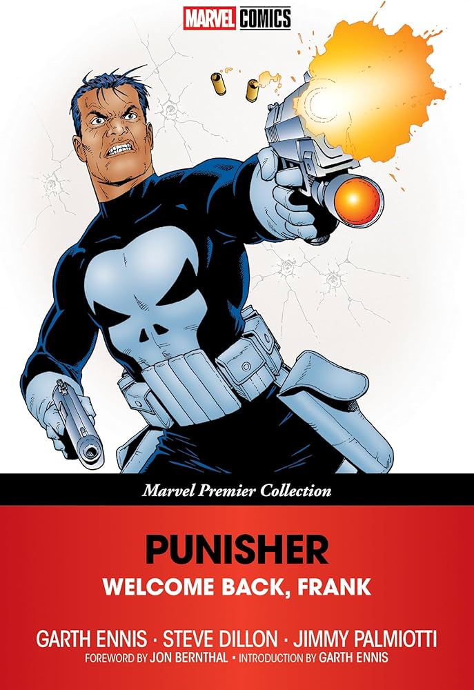
Review – The Punisher: Welcome Back Frank

Review – The Punisher: Welcome Back Frank Publisher: Marvel Comics/Marvel Knights Writer: Garth Ennis Penciller: Steve Dillon Inker: Jimmy Palmiotti Colourist: Chris Sotomayor Letterer: Wes Abbott & Richard Starkings Release Date: April 2000 – March 2001 The very first time that Garth Ennis wrote Punisher in Punisher Kills The Marvel Universe, some of his dialogue was changed in editing without his consultation. This led to Ennis not wanting to write for Marvel going forward, until they offered him the chance to write Punisher again, but this time under the Marvel Knights umbrella. This meant that Ennis would have more creative control and wouldn’t have to worry as much about including more explicit content. Punisher: Welcome Back Frank is the result of that offer. Something I realised upon revisiting Welcome Back Frank for review was that this is probably the most fun that a Punisher comic has ever been. Don’t get me wrong, – I also love the classic version of the Punisher as well as the more sombre version of the character that we got in Garth Ennis’ Punisher Max run, but those versions didn’t have Frank punching a polar bear in the face. This book also contains my favourite depiction of Lieutenant Martin Soap ever committed to print. Ennis also writes this version of the character with a surprising amount of humanity. It’s not exactly as if Frank is super social and has a group of friends, but there are people featured throughout the story that he does seem to care about. This isn’t something that can be said about most other iterations of the character. I am also a fan of how Ennis writes Frank’s inner monologue in this run. As he is a man of few words, the use of inner monologue allows readers to get a glimpse into Frank’s mind without betraying his badass demeanour. Something that I also find fascinating when comparing this run to Ennis’ later run on Punisher Max is their respective approaches to how they handle violence. His Marvel Knights run takes a much more comedic, light approach to the extreme violence that takes place, whereas in Punisher Max the violence seems to carry much more weight and has a more sinister feel to it. It is also interesting to consider when the books were written and released. The American attitude to violence changed drastically between the release of the two runs due to the 9/11 attacks. This seemingly also affected the way that Garth Ennis saw violence and in turn changed the tone of how he chose to portray it in his work. Steve Dillon’s pencils are a huge part of what makes this run so much fun. If you have witnessed his work in Preacher, you will know that he had the unique ability to illustrate somewhat taboo scenes of violence and yet still manage to keep them light, never drifting into showing excessive depictions of gore. I have also always loved the way that Dillon was able to capture a character’s expression and this story allows for many examples of that. There are also several gorgeous splash pages in this book that really demonstrate Dillon’s abilities as an artist. He chose to conclude the first issue with an iconic silhouette of Frank overlooking the Southside of New York and it really captures the love that Dillon clearly has for the city. Ennis and Dillon both lived and worked together in NYC for many years, so the city clearly holds a special place in the artist’s heart. Steve Dillon sadly passed away suddenly back in October 2016 due to a ruptured appendix. It was a devastating loss to the comic book industry that is still felt today, but his legacy continues to live on through his work. Overall, getting to review Welcome Back Frank really solidifies it as an all-time classic for me. It is a phenomenal starting point for the character due to Garth Ennis’ masterful writing and Steve Dillon’s glorious artwork. I would recommend anyone to pick up this book and read it through, – whether they happen to be a fan of Punisher or not, – as this book is a great time for any reader that decides to give it a go.

Review – The Punisher: Welcome Back Frank Read More »

power rangers ninja turtles

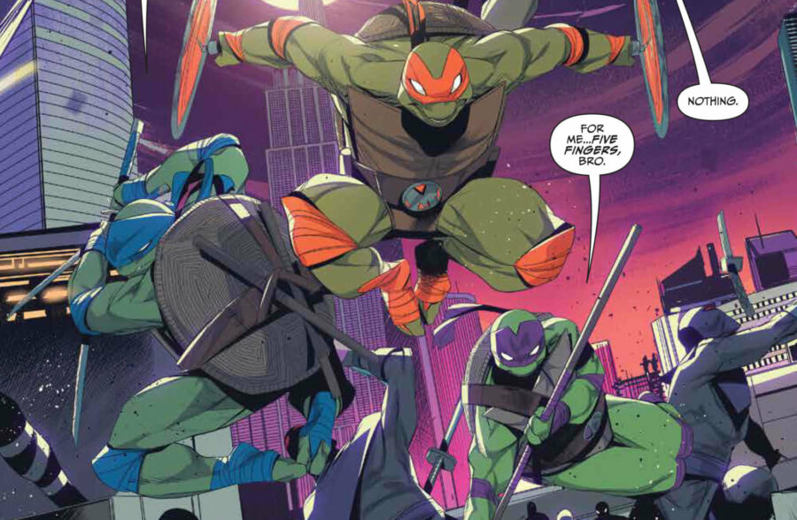
Review – Mighty Morphin’ Power Rangers/TMNT

Review –  Mighty Morphin’ Power Rangers/Teenage Mutant Ninja Turtles Publisher: BOOM! Studios/IDW Writer: Ryan Parrott Art: Simone Di Meo with assistance by Alessio Zonno (Issues 2-5) Colouring: Walter Baiamonte with assistance by Igor Monti Release Dates: 18 December 2019 It’s Morphin’ Time! Picture this: it’s Saturday morning, say around 10am. You’re excited as in 15 minutes will be your favourite cartoon. Those 15 minutes feel like a lifetime as a kid but eventually you hear that familiar tune; “Go, Go, Power Rangers…” / “Teenage Mutant Ninja Turtles…” For the next 20 minutes you are glued to the TV. Nothing gets in your way. No outside sounds. Just you, the TV and your favourite heroes on screen. Dear reader, this was exactly how I felt reading this comic! It was a nostalgia trip from beginning to end. I could hear the characters in my head. The theme tunes were running amok inside my child-like brain. I was transported back to that Saturday morning I mentioned. Story For the first time ever, the Heroes in a Half Shell meet their colourful counterparts; The Mighty Morphin Power Rangers. Arriving in New York, the Rangers are in search of their friend and teammate Tommy Oliver-aka The Mighty Morphin’ Green Ranger. They however discover that he has joined forces with Shredder and his Foot Clan, the Turtles sworn enemy! They themselves join forces with the Turtles to battle Shredder and his new cohort: Rita Repulsa! Ryan Parrot’s writing helped bring these superpowered groups to life. Art Along with Parrot’s writing, Simone Di Meo’s art, (with the assistance of Alessio Zonno who penned issues 2-5), takes us on an epic journey where we meet familiar faces as well as some new ones (Turtle Rangers, anyone!?). Walter Baiamonte and Igor Monti’s colouring makes every page of this comic just pop! It was honestly as though I were watching a TV show rather than reading a comic. As a kid who grew up watching both these shows, I would honestly love to see a live action crossover one day! Verdict I was slightly hesitant of reading this, truth be told. I liked the look of the cover but felt a slight pang of “Oh no, what if this is just childish?” However, I was very much proven wrong! Who cares if it was childish? I watched these shows when I was younger and this was no different. It brought back all my fond memories and I loved it from beginning to end. I highly recommend this to anyone of all ages. If you enjoyed this review, please leave a comment and/or your own rating!

Review – Mighty Morphin’ Power Rangers/TMNT Read More »

Tom King's Vision

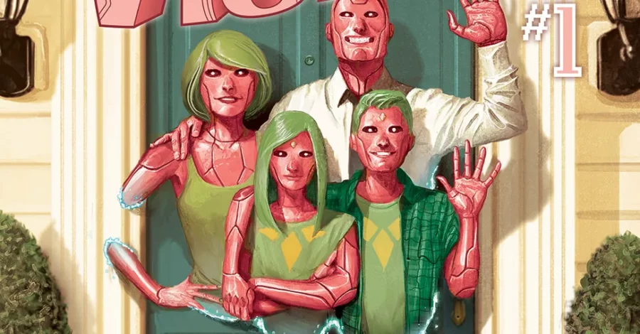
Review – Tom King’s Vision

Review – Tom King’s Vision Publisher: Marvel Comics Writer: Tom King Art: Gabriel Hernandez Walta (Issues 1-6, 8-12), Michael Walsh (Issue 7) Coloring: Jordie Bellaire Lettering: VC’s Clayton Cowles Cover/Back Art: Mike Del Mundo (Issues 1-4, 7-12), Marco D’Alfonso (Issues 5, 6) Release Dates: January 2018 (Complete Collection) INTRODUCTION Tom King doesn’t generally write happy stories with happy endings. If you’ve read any of his work on Batman, Heroes in Crisis, or his celebrated Mister Miracle miniseries, you already sort of know this. King likes to write heroes who are really dealing with their traumas and their darker sides, which doesn’t always work (again; see Batman, maybe his most divisive work), but when it does, it does to tremendous effect. So it is with Tom King’s take on The Vision, a character who has gone from one of the most obscure Marvel heroes only a few years ago, to a dining room table name thanks to the MCU movies and the extremely successful WandaVision streaming series. Vision is a series that deals with a multitude of heavy topics, all weaved together in a complex story line that feels longer than the twelve issues that it occupies. It poses questions about what it means to be human and how we all deal with trauma in a few different, yet equally relatable ways. In our review of Tom King’s Vision, we’ll take a look at how effectively King broaches these subjects, and maybe answer one other question: How far would you go for your family? STORY The premise of Vision is simple: In his ongoing quest to understand humanity and distance himself from the cold, genocidal machinations of his ‘father’ Ultron, Vision has built himself a family. A traditional, white picket fence, all American nuclear family with a wife and two teenage children, a son and a daughter. Vision and his family have recently moved to Virginia to accommodate for a job that Vision has taken up as the Avengers liaison to the White House. All Vision wants to do is have a normal, unassuming, suburban life. He has ‘dinner’ at the table with his family every night (they don’t eat, as we learn within the first few pages, but they all sit around a table and beam recorded experiences of their day to each other). Vision leaves for work every morning and waves to his neighbors (while floating through the air), and sends his kids to school every morning (where they’re dogged by the other children for being what they are). Alright, so his life isn’t quite normal. It’s an approximation of a human family life, and if these almost-human activities make you feel a little uncomfortable, that’s somewhat intentional. Very quickly within the story, an event occurs that sends things spiraling nightmarishly out of control. I don’t want to spoil anything too deeply, but this traumatic event is the catalyst that Tom King uses to really explore the humanity of these characters, and somehow manage to effectively portray PTSD in artificial life forms that barely understand their own feelings. Vision’s son, Vin, noticeably develops a sort of obsessive compulsive trait. He becomes enamored with Shakespeare and spends almost all his waking time at home loudly acting out his favorite passages in what I can only imagine as a Patrick Stewart like manner. Virginia, Vision’s wife, begins to become stuck on some words, repeating them two or three times, and finds herself lying multiple times to protect her family. These personality quirks that emerge in these synthetic humans work as a fantastic contrast to their otherwise very robotic behavior. In one very early scene, Vision and Virginia debate the meaning of ‘kind’ vs ‘nice’, and somehow King manages to make their dialog seem both cold and logical, and compelling and loving. His ability to write these characters as both chillingly robotic and charmingly human is maybe his greatest strength in this book. You want to root for the Visions, even as you become slowly more horrified by them. All of this is put together in a way that asks the question of what it really means to be human. Vision isn’t human, technically speaking, but he understands the idiosyncrasies of humans and attempts to mimic them. Virginia isn’t human, yet she lies to protect her family like any human mother would, and she cries over memories that aren’t hers (read the book for the backstory on that particular nightmare). Viv, Vision’s daughter, isn’t human, but he develops a crush on a human boy and replays the memory of the one conversation she has with him over and over to herself, even though she doesn’t fully understand the feelings she’s expressing. So do you really have to be flesh and blood to be human? Do you have to have a soul? I don’t have the answers to those questions, but what I can tell you is The Visions are one of the most human comic book families I’ve ever read. The style of the story is very much echoed in the later work King did on Mister Miracle, juxtaposing banal family life against life or death comic book shenanigans. If you read that book, and liked it, this will absolutely be right up your alley. You’ll feel for this family, you’ll fear for the family, and at points you will fear the family. Upon review, Tom King’s Vision is his work at its best, and it’s a narrative not to be missed. ARTWORK Gabriel Walta’s artwork in Vision is a perfect visual style for Tom King’s domesticated drama. His panels are clear, big, and colorful. His characters are emotive, full of vibrant facial expressions and body language that clearly and effectively evoke the emotions running high through the book. Just as well, when the story moved in to darker or more disturbing territory, the art changes to match this as well. This is most noticeable in the coloring, performed by Jordie Bellaire. The hues are warm and inviting when we’re following

Review – Tom King’s Vision Read More »

Review - Jim Cornette Presents: Behind the Curtain

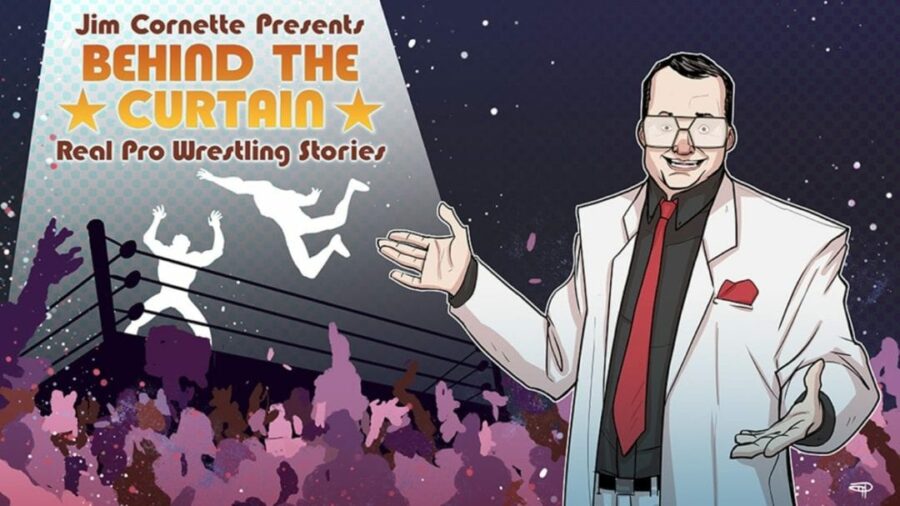
Jim Cornette Presents: Behind the Curtain

Jim Cornette Presents: Behind the Curtain Published by IDW Publishing Written by Brandon Easton Art by Denis Medri Released – August, 2019 INTRODUCTION Jim Cornette Presents Behind the Curtain is an illustrated episodic docu-comic about the golden age of professional wrestling and it’s dark but brilliant veil of commitment. Presented by Jim Cornette himself -doing his best Rod Serling impression, we dive deep into the wrestling’s Twilight Zone. Yes, this is a comic book. All of the traits of a comic are here; superheroes and supervillains with super strength, super intelligence, regenerative powers and high-risk world-shaking stakes. However, these stories are not fake. They are Kayfabemania running wild and they are very much real. Step into the story-time squared circle with Jim Cornette and prepare to get slammed.  STORY If there was one person capable of sharing how off script the predetermined world of professional wrestling goes, it’s the all-around wrestling businessman and notorious, Jim Cornette. Say what you will about Cornette, the man knows his wrestling history and does a great job in touring the reader through the backstories of wrestling’s works as well as his own involvement within the infamous Montreal Screwjob.  To the best of my knowledge as a diehard wrestling fan along with some research, his telling of the stories is 100% factually accurate…which is both utterly fascinating and terrifying to think about! I hope that the predominant belief that “professional wrestling is fake” will be slammed to the mat, pinned for the 1, 2, 3 count and retired while the crowd chant in unison “THIS IS AWESOME!!!”.  Just to lay some perspective myself. For those who aren’t convinced of the reality of professional wrestling, your favourite shows like Game of Thrones and Coronation St. are absolutely predetermined and fake. Cornette puts it best himself when he says that professional wrestling is a three-ring circus of sport, theatre and psychological manipulation. For the most part, it is live entertainment; No stunt doubles, no redoes, the botches although rare, are still inevitable for beholders to witness and are there to remind them that this industry is indeed still real, damn it!  Cornette and through the art of gripping storytelling with no one to interrupt him, produces thought provoking arguments against the state of modern professional wrestling when emphasizing the bleak and almost military approach to kayfabe. With the rise of the internet and social media, the walls of kayfabe and commitment to character can be torn down by just a simple click to the point where over the top gimmicks have all but been buried in the dirt.  In the golden age of wrestling however – and much like every superhero ever, professional wrestlers would withhold the locker room law of protecting your real identity from the public so to abolish any criticism of faux fighting, sometimes to questionable and devastating levels of commitment; like Daniel Day Lewis being cast as The Joker. Yeah, THAT kind of commitment. ART Medri’s artwork presents wrestlers with details and proportions that are wholly unrealistic for the most part; Ric Flair was not Goliath in stature, he was a guy. This, however, is not a criticism as the style beautifully represents the nostalgia of a fan recalling their memories of awe-inspiring icons under the spotlight from the front row of the arena as a child. Cementing the legacy of these very human legends as superhuman Superstars. That being said, oh god the eyes. THOSE HORRIBLE EYES!!! As mentioned before, Cornette appears to be narrating the Twilight Zone like he’s the Rod Sterling of wrestling as it unfolds around his every fourth wall breaking word.  OUR REVIEW Overall, no matter your opinion on Jim Cornette, his telling of wrestling’s no holds barred history is fully engaging and earth shattering whether you are a wrestling fan or not. What has fascinated me most is that I had never heard the stories before and I am dumbfounded, gobsmacked and worked that Hollywood hasn’t picked up one story in particular that would change the world of storytelling forever, ironically just as the heel in question did for humanity back in his day.  The novel is a great way for existing fans to expand on their knowledge of the wrestling world and maybe even introduce them to classic matches if they are relatively new fans of the sport. I myself have more respect for the grandfathers of wrestling than I ever had, now that I have found this book and will recognize names like Sputnik Monroe, Jerry Lawler and even Jim Cornette himself, as some of the most influential characters in the art and sport of professional wrestling.  So, whether you’re a mark for wrestling or a guy called Mark that doesn’t know what a kayfabe is, this book is the main event and is a stunner throughout.  PS. If you don’t know what Kayfabe is, this book also works as a wrestling dictionary! 

Jim Cornette Presents: Behind the Curtain Read More »

all star superman

Review – All Star Superman

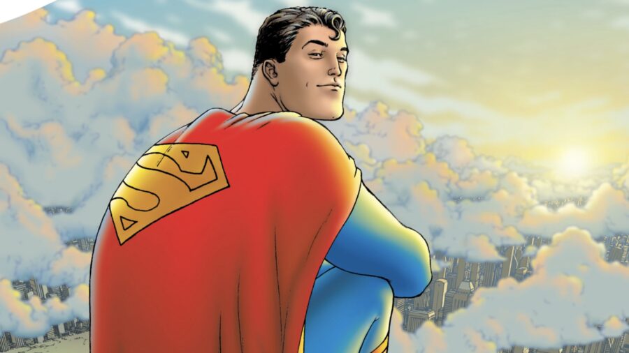
Review – All Star Superman Publisher: DC Comics Writer: Grant Morrison Penciller: Frank Quietly Inker: Jamie Grant Colourist: Jamie Grant Letterer: Phil Balsman & Travis Lanham Release Date: November 2005 – October 2008 Getting to review All Star Superman was great as it allowed me to revisit one of my favourite comics ever written, bearing in mind that I am not someone who has ever necessarily been a massive fan of the Man of Steel and have always preferred him as a side character in a Batman story. The book was written as a jumping in point for wannabe comic book fans, meaning that you can go into this story with little to no prior knowledge of Superman and still have a great time and appreciate everything going on within the plot. That being said, even if you are well versed in Superman’s lore, you will probably still very much enjoy this book and Grant Morrison’s take on the character. Morrison’s writing moves the book’s plot along at a brisk pace, but is careful not to convolute itself. They manage to keep even the most out-of-the-loop readers abreast of what is going on, without ever having to talk down to them or be condescending in their writing. I also love how he opens the book with a single page showing Superman’s origin story, before cutting immediately to a beautiful two page spread showing the Man of Steel in all of his costumed glory. As may be expected when it comes to Grant Morrison, the book doesn’t shy away from going cosmic on us early on, showing Superman flying around the circumference of the sun. I also really enjoy Morrison’s take on Kal El and Lois’ relationship and how that relationship changes and evolves over time. Any relationship that includes a person from another world is going to be a complex one with multiple layers and facets to it. The other major relationship in Superman’s life is the one that he shares with Lex Luthor. I really enjoy how Morrison writes Lex here as an unflinching sociopath who is willing to go to any lengths necessary to see his plans through to their conclusion. Quitely’s art smoothly compliments the story being told and is key in making this book as well-loved as it is. I love the clean, crisp illustrations and I am actually a fan of the Superman built like Desperate Dan and appreciate the homage that Quitely pays here to the comic books of his youth. Jamie Grant’s choice of colour is also a big part of what makes the book iconic. The pages of this book are instantly recognisable at even the briefest of glances due to to the bright, varied colours throughout each page. However, pages still manage to never look garish or gaudy; instead the colours all work to compliment the illustrations and bring each panel to life. Coming away from having re-read All Star Superman for review, I enjoyed my time with it just as much as I did the first time I read through it. Grant Morrison really hit the nail on the head with this take on the character and gave us the quintessential alternative version of the Man of Steel. Whether you are a big Superman fan or not, go read this book and you will have a great time. Oh and it’s just a little bit better than its All Star Batman and Robin counterpart by Frank Miller and Jim Lee!

Review – All Star Superman Read More »

the walking dead volume 1 days gone bye

Review – The Walking Dead Volume 1: Days Gone Bye

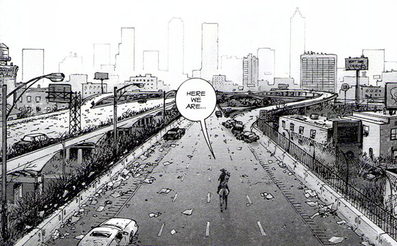
Review – The Walking Dead Volume 1: Days Gone Bye Publisher: Image Comics Writer: Robert Kirkman Penciller: Tony Moore Inker: Tony Moore Letterer: Robert Kirkman Release Date: October 2003 – March 2004 The Walking Dead comic recently came to an end, so getting to go back and review Days Gone Bye, – the first volume in the series, – was an opportune chance to revisit how this pop culture juggernaut came about. The Walking Dead tells the story of Rick Grimes; an Atlanta sheriff who gets flung headfirst into the zombie apocalypse, which throws an overwhelming amount of un-dead corpses his way and exposes the brutality required to survive this harsh new world. Where most other zombie media focuses on the actual zombies and monsters killing human characters, The Walking Dead instead chooses to focus on the human relationships within the group of survivors that we follow. Although this has become somewhat of a trope over recent years, reading The Walking Dead was the first time that I saw the concept of ‘fight the dead, fear the living,’ actually realised and at the time I thought that it was fantastically original and refreshing. Unfortunately, we have been somewhat bombarded with zombie media to the point of parody since this book’s debut and the market has become extremely saturated in the years since it released, but credit is still due to the story that started it all. This idea has been parroted many times since because it was an awesome idea to begin with. Beyond the initial innovative idea though, the writing has to be there to back it up. Robert Kirkman is brilliant at building his universe and really making his characters and settings feel fleshed out. This was also one of the first comic books I read, where I really felt the constantly present threat that the characters had to live with on a daily basis and it honestly does feel like no character is ever truly safe. Kirkman does somewhat lean on shock value to keep readers engaged in this book, which is not always something that I am a huge fan of. He also isn’t afraid to explore extremely dark themes and sadly doesn’t always do so with the most subtlety or grace, resulting in some tactless excess and some poorly handled choices. Tony Moore manages to capture a brilliant level of detail and expression in every frame of this volume. I also love the clarity of his artwork; there is never a point in this book where I felt confused as to what I was seeing. The version of the book I read for review had also been coloured, however when I originally read the book, it was in black and white. To be honest, I think I prefer the B&W approach as it fits the horror theme of the book better and doesn’t look as cartoonish. Admittedly, as much as I enjoyed Tony Moore’s work in this volume, Charlie Adlard took over art duties from volume 2 onwards and I much prefer his work. Adlard’s drawing style is wildly different to Moore’s and it does take some getting used to, but once you settle into it, it is great. Overall, I really enjoyed going back and reading Days Gone Bye for review. It is pretty amazing when you consider all of the other media that has spawned from this single comic. Some of the writing can be fairly clumsy at times and Moore’s art carries a certain cheesiness to it, but there was enough talent onboard here to bring this franchise to life and the rest is history at this point.

Review – The Walking Dead Volume 1: Days Gone Bye Read More »

planet hulk comic

Review – Planet Hulk (2006-2007)

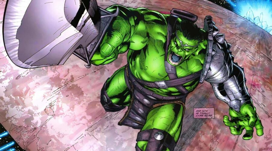
Review – Planet Hulk Publisher: Marvel Comics Writer: Greg Pak Pencillers: Alan Lopresti, Carlo Pagulayan & Gary Frank Inkers: Danny Miki, Sandu Florea & Jeffrey Huet Colourist: Chris Sotomayor Letterer: Randy Gentile Release Date: April 2006 – June 2007 So I just finished re-reading Planet Hulk for review and honestly it was a bit of a slog to get through. I first read this book back-to-back along with World War Hulk when I seriously first got into comics back in 2013 and I remember really enjoying it. The reason that I made sure it was one of the first books I read when getting into comics was because it was so often recommended in a ton of articles and online forums as a highlight for Marvel and as a must-read book. When I read through it for the first time and put it down, I really thought that it deserved all of the high praise and accolades that it received and it has really held a spot in my mind over the years as a prestige of comic book storytelling. After revisiting it though, I realise that there is a good chance I was looking back at it through rose-tinted glasses. I also wonder if my memory has been somewhat clouded due to my enjoyment of Taika Waititi’s Thor: Ragnarok, which took a number of elements from Planet Hulk. In actual fact, Planet Hulk consists of a meandering plot and lacks the punch that’s carried by most other classic Marvel stories. The book starts off by making the Avengers members that decide to send Hulk away, (AKA The Illuminati) look pretty cold and heartless. I appreciate that these characters aren’t totally one dimensional good guys all of the time and have occasionally did some questionable, shady things through the years, but for them to just randomly send away one of their greatest assets without any real motive seems very out of character. Once Hulk arrives on Sakaar, this could essentially be any random sci-fi comics and there is no real reason for the story to be a Marvel book any longer. The entire plot feels incredibly detached from the Marvel universe to the point that I found it quite hard to care about any danger or peril that the characters were faced with. It also doesn’t help that the one character we follow that we do know is probably the hardest Avenger to relate to since he is a hulking green monster that rarely says more than one word sentences. I realise that the following statement may be sacrilegious to some comic book geeks, but I have never really been a fan of when the Hulk speaks. I am okay hearing him say the occasional throwaway word or short phrase, but when he is speaking in long detailed, articulate sentences, I struggle to buy it and by the end of this book, he is strategising and governing like he has studied the Art of War. It makes him feel even less like the Hulk character that we know from Marvel comics and makes this story feel even more detached, like some kind of Elseworlds tale, but no this is all still apparently taken place within main Marvel 616 canon. I have heard a few people argue that this book works as a set up for the more exciting follow up, World War Hulk. However I really don’t think that 330 pages of set up were necessary to tell that story. Reading the book felt like somewhat of a chore this time around and dragged on far more than I remembered which resulted in me really struggling through it. The artwork in the book is decent and is consistent throughout. I really enjoyed the pencils and inks throughout the book. Honestly the only issue that I had was that I felt that Alan Lopresti’s, Danny Miki’s and Chris Sotomayor’s talent were wasted here to a certain extent. Somewhat similar to how I felt when witnessing Jim Lee’s stunning artwork in All Star Batman and Robin, although maybe not quite to that extent. Frankly, this is a book that I wish I had never revisited. It really let me down in terms of it’s level of quality in my mind and I would actually recommend against revisiting it if it is a book that you enjoyed a number of years ago.  

Review – Planet Hulk (2006-2007) Read More »

dark knight returns

Review –The Dark Knight Returns

 Review –The Dark Knight Returns Publisher: DC Comics Writer: Frank Miller Penciller: Frank Miller Inker: Klaus Janson Colourist: Lynn Varley Letterer: John Costanza Release Date: February – June 1986 The main reason that I wanted to go back and review The Dark Knight Returns, was to give it another chance to impress me. Back in 2013 when DC announced Dawn of Justice at the San Diego Comic Con, that was the moment that I decided to get into comics properly. I had read the odd section from random comics before that, but had never actually sat down and read a comic from start to finish. So after seeing this book on so many top ten lists online and jumping aboard the hype train for Batman V Superman, I sat down ready to be blown away. Unfortunately I was let down in a big way. Perhaps this would have been different if it didn’t have all of the hype surrounding it, but I came away slightly disappointed. Although I have read it a few times since, now almost eight years after first reading the book I decided that it was time to give it another proper chance to astonish me. Sadly after rereading the TPB, my thoughts remain pretty much the same as they did upon first reading it. Although there are certain elements to the story that I really enjoy, I still feel that overall the book is very overrated. However, that’s not to belittle the parts of the book that are brilliant and after revisiting it again and thinking about in a historical context, I can see why it earns a spot in so many people’s top ten lists. The way that Miller writes Batman and Joker are written here is rather interesting; showing a twisted love/hate relationship with multiple layers. Also, I have always loved the idea that without an active Batman there is simply no reason for the Joker, as they are two sides of the same coin. This seminal story is a considered a classic for a reason and is responsible for so many of the characters trademark features that we can still observe to this day in modern Bat-media. Frank Miller absolutely changed the course of the character’s tone and universe and managed to make Batman cool again after being a laughing stock in the years following the Adam West show. I think this is a change that absolutely had to happen for the sake of the character going forward. The main thing that I struggled with upon first reading through the book and something that I still struggle with today when I open any page of the book, is Frank Miller’s artwork. I have never been a fan of Frank Miller’s drawing style. A lot of people slight his artwork on his book post 300, but to be honest I have never really liked it. I don’t like the way he draws people and faces, his proportions and the way he captures posture always seems to look off to me. Nor am I fan of the muddiness present in a fair amount of the book’s panels. There is some brilliant clear use of colour in certain panel and others, – particularly Batman’s fight with the leader of the Mutants, – just seem to look like an ambiguous mess for some reason. That’s not to say that there aren’t some phenomenal decisions made when it comes to character design. So many of the stylistic choices that Miller made here are iconic at this point and have influenced so much of the Batman media that has followed in the years since; you just have to look at the Snyderverse for a prime example. Though, I have never been a huge fan of this book’s ridiculously chunky version of the Batmobile. My main takeaway after going back to review The Dark Knight Returns, is that although I find it overrated, I can understand why so many others hold it in such high regard. Art is always very subjective and I appreciate that I am in the minority when it comes to my distain for Miller’s pre 2000’s artwork, but I simply don’t find it enjoyable to look at. However, all of that being said, I do believe that this is a Batman story that everyone should read at some point, even if it is just to see where the influence came from for so many elements used in Chris Nolan’s and Zack Snyder’s films. The Best Value (Paperback): ? [Batman: The Dark Knight Returns (30th Anniversary Edition)] The Collector’s Dream (Absolute Edition): ? [Absolute Dark Knight (New Edition)] The Complete Frank Miller Batman [Batman: Year One. Wanted: Santa Claus Dead or Alive. the Dark Knight Returns ] : ? [The Complete Frank Miller Batman (Leatherbound)]  

Review –The Dark Knight Returns Read More »

Scroll to Top