Comic

BGCP Podcasts and Comic Con


BGCP Comic Con was started as The Big Glasgow Comic Page back in July 2012 mostly out of boredom and trying to find more Comic Fans to speak to, The Scottish Facebook Page gathered likes extremely fast as there wasn’t anything like it at the time and eventually this led to a Comic Book Group, Pub Quizzes, Tournaments and eventually a Comic Book Market  based soley in Glasgow.  We organized BGCP Comic Markets for several years until we had outgrown the smaller venues in Glasgow City Centre so set out to run Comic Cons in and out of Glasgow and further over Scotland including East Kilbride, Rutherglen, Loch Lomond, Dunoon, Aberdeen, Bathgate, Edinburgh, Glenrothes, Kirkcaldy and countless more towns and cities. 

BGCP Comic Con is a series of Scottish Conventions that happen in and around Glasgow, Fife and Aberdeen. BGCP also publish articles, reviews and news.

Previous Convention Guests have included Frank Quitely, Al Ewing, Alan Grant, Gary Erskine, Monty Nero, Yishan Li, David Baillie, Grant Perkins, David Bishop, John Lees, Jim Stewart, Tom Foster and Neil Slorance

We cover Comic Books News, Articles and Reviews from Marvel Comics, DC Comics, Image Comics, IDW Publishing, BOOM Studios, Dark Horse Comics and many more. We also provide the same for movies, television and video games.

Here are some of the main companies and characters that BGCP covers – Marvel Comics, DC Comics, Image Comics, IDW Publishing, Dark Horse Comics, Dynamite, BOOM Studios, 2000AD, Titan Comics, Legendary Comics, Millarworld, Aftershock Comics,Valiant Comics.

BGCP Podcasts

BGCP launched the BGCP:Disassembled Podcast in February 2021 and release weekly episodes featuring the latest comic book news and reviews, we also run weekly interviews and have also featured many writers and writers from Marvel, DC, Image and more.
Review - Doomsday Clock

Review – Doomsday Clock

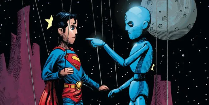
SUMMARY Doomsday Clock is a 12 issue comic series from DC Comics (oh my god I just realised DC stands for Doomsday Clock in this context, don’t tell me I’m wrong.) featuring an all-star cast of your favourite DC characters such as Batman, Joker, Superman and Lex Luthor, but what’s that in the sky? Is it a bird? Is it a plane? No, it’s the Watchmen! Crashing into the unfamiliar yet familiar territory of Gotham City. Once initial pleasantries are made between both sides, the race is on to beat the clock and save this world from itself and in turn save everyone.   DOOMSDAY CLOCK ART It’s only when you see both worlds and characters of The Watchmen and Batman & Superman that you see the similarities in their dark and gritty yet colourful and classic design. The pencil art by Gary Frank and use of colour by Brad Anderson seamlessly synergises with the exciting yet tragic story of a group of superheroes in charge of saving a doomed world. The covers of the collection alone are stunning to look at, each with its own unique and poetic nuances. It’s hard to choose a favourite and that speaks volumes as several of the comics have alternate cover art, I don’t even think Frank and Brad could decide on the best fit for each issue so why not have both?  Covers aside, there are some truly incredible panels of art within these comics. Some are bombastic and badass whereas others are subtle and seductive but like seductive in a how a director lines up a shot perfectly to tell a story and then takes it to the bedroom…to hang up on his wall because it’s ART!    DOOMSDAY CLOCK WRITING Do you know what’s harder to keep track of than a multiverse in comics? A world! Let me explain, a multiverse knows it’s a huge thing so it only gives you the prime details you need to know about. A world however, is small enough that it decides to give you every detail It has about it in the hopes that it’ll be easy to follow because it’s not as big as a multiverse. this series has 3 worlds, time travelling and a multiverse!  Despite the subject matter and level of events going on, Doomsday Clock is surprisingly easy to read. Fully grasping and reciting the subject matter and events however – especially when trying to review it (little meta-humour for you dear reader), is gonna require some quiet reflecting and a déjà vu ridden reread of the series. Even if you do understand what’s happening, the series deserves the reread in order to engross yourself in the foreshadowing throughout. With the use of real-life figures, global news broadcasts and an extensive lore of the worlds provided in everyday formats like newspapers, letters and photographs, you often forget you are reading a work of fiction. With the year we’ve just had, even the outrageous and supernatural events don’t seem to break the illusion. Not to mention this serves as additional immersive context for the reader who perhaps isn’t as familiar with the universe and its characters. As mentioned, the collection features an all-star cast of DC favourites. Seeing those characters interact and pair with each other makes for some interesting developments and fun internal commentaries. Batman and Rorschach trying to out-brood each other is a comic book fans’ vigilante fantasy…vigilantasy if you will! As well as those favourites we also get meta glimpses into the more obscure characters of DCs history such as various incarnations of the Justice League and international superheroes yet to make their mark. The cherry on top is the promise of new fan favourites in the near future and the promise of an ever-expanding story that will kick down the forbidden comic book doors. We recently reviewed the Classic Watchmen book, check it out here OVERALL REVIEW Move over MCU with your Infinity Wars, Endgames and maybe even some of your Wandavision. THIS is the most gripping and mind-blowing collection of comics I have ever read. Doomsday Clock demands a film adaptation whether it be live action or probably for the best, an animated trilogy of films. This is what the DCEU films should be working towards; A truly visceral and ingenious experience with a web of suspense and tragedy that is a thank you series to the diehard fans of DC. Any comic book fan should add this series to their collection as it is a masterclass in effective storytelling and artwork.  Let us know in the comments your thoughts on our review of Doomsday Clock, your favourite DC Characters and what you’d like to see from an adaptation!

Review – Doomsday Clock Read More »

JLA- Earth 2 A Tale of Dark Reflections

Review- JLA- Earth 2 A Tale of Dark Reflections

Review – JLA: Earth 2 Publisher: DC Comics Writers: Grant Morrison Artists: Frank Quitely Colourists: Laura DePuy Letterer: Kenny Lopez Release Date: 2000 Intro When you think of the Justice league, you think capes, cowls and most importantly heroes. So what happens when you take these beloved characters and twist them into something different, perverted even? You get Grant Morrison’s and Frank Quitely’s ‘JLA: Earth 2’. The premise of the book by the incomparable Scottish duo sees the Justice League face their greatest threat. Their own reflections. Morrison offers up a deliciously interesting take on what it means to be good or Evil. As no matter how good you are you will always have a perverted reflection that is worse. Plot ‘JLA: Earth 2’ tells the tale of an earth not dissimilar to our own except ruled by the Tyrannical ‘Crime Syndicate’. Composed of Ultraman, Owlman, Power Ring, Johnny Quick and Superwoman they rule their ‘Antimatter’ Earth unopposed. That is until the arrival of Superman, Batman and most of the Justice League. Who sent on a mission by an unlikely Ally, attempt to free the world from these villains forever. Writing The opening for ‘JLA: Earth 2’ starts as you would expect many early 2000’s Justice League story’s to begin. With a sweeping full-page splash of the JLA’s Moon base the ‘Watch Tower’. However, from within the first two pages it is established that something isn’t right. With a group of Shadowy figures discussing the situation of an escaped prisoner. The final panel of the second page is a close up of a familiar cape bearing a giant ‘U’. This sets up the book within the first view pages establishing the unfamiliar nature of the world and its inhabitants. Morrison is an expert storyteller, creating a world that is uniquely identifiable but still built on the normal DC universe. The concepts used in this book such as a Lex Luthor being a hero or an evil force invading from another Earth have become part of some of the best DC stories. Morrison’s version of the Crime Syndicate has also gone on to influence other itterations of the villians including in the brand new Crime Syndicate Book spinning out of Infinite Frontier. CSA Vs JSA I’m going to spoil some key character moments in this section so spoilers ahead. Morrison does an expert job extracting the key aspects of each hero and contorting them into darkness. First up Is Owlman who is the ‘dark reflection’ of Batman. It’s fair to say he is psychotic.The fact he’s Bruce Wayne’s brother on ‘The Antimatter’ Earth who witnessed his brother and mother be shot dead, probably doesn’t help his mental state. In his first appearance he murders a bunch of Gotham policemen all in the spirt of tormenting his father who is commissioner of GCPD on this earth. Owlman is intelligent and manipulative, being the brains behind the syndicate and the first one to figure out what is going on with the Justice League. He is also having an affair with Superwoman as its revealed later on he has black mail on Ultraman. Speaking of Ultarman, he is the pumped-up jock in comparison to Superman’s Small town boy. Ultraman is basically what would happen if you gave the bully at school superpowers. Whilst Superman understands the weight and responsibility of his power, Ultraman Revels in it saying, ‘There is no such thing as partial success’. Soon after annihilating a Civilian who speaks out against him. Ultraman is greedy and the reference I made to being a pumped-up jock is not me being hyperbole. His powers isn’t from his alien physiology like Superman but Anti-Kryptonite, a drug he takes in order as Wonder Woman says it: ‘The stuff you need to Keep you Ultra’. Morrison shows how Greed and power corrupts, and that the antithesis of a character like Superman, is in all honesty a whiney bitch, which makes him a villain you love to hate. Superwoman is arguably the most reasonable of all the villains, being the one that is closest to their counterpart.  Taking the alias Lois Lane, Superwoman is an Amazon by birth, and has risen through the ranks to become the chief editor of the Daily Planet This disguise resembles Wonder Woman’s secret identity of Diana Prince, whereas her hero costume in turn resembles that of a ‘dominatrix’. Even her version of the ‘Lasso of truth’ is perverted being named the ‘Lasso of Submission’. Jimmy Olsen is the only civilian who knows of Superwoman’s secret identity. The depiction of the Plant’s staff photographer is as a compliant sexual deviant, he does what she tells him in exchange for the favour of watching when she changes her outfit and receiving pieces of it for his “disguise kit”. Morrison does not shy away from the kinkier origin of Wonder Woman as a character, showing what would happen if the Themyscira Princess had embraced her darker side. The other Members of the society who appear in the book with less important roles are Johnny Quick and Power Ring. Quick is a drug addict who similarly to Ultraman must shoot up with a speed serum to retain his powers. Power Ring closely resembles the golden age Green Lantern Alan Scott but that’s where the similarities stop. With him being a meat head who doesn’t understand how his powers actually work.   Political Satire The overall tone of ‘JLA: Earth 2’ is darkly funny, pressing a fine line between a superhero story and referencing the political Zeitgeist of the year 2000. Morrison makes a point of criticizing the capitalistic nature of US politics of the time, with the brief appearance of the president of the United States on the ‘Antimatter’ Earth. Morrison shows him as a coward keeling over to whoever is the most powerful force in the world at the time. Thusly, there is no coincidence that Quitley’s drawings bare a striking resemblance to a mixture of former presidents. Morrison also pokes fun at British media

Review- JLA- Earth 2 A Tale of Dark Reflections Read More »

Review- Green Lantern: Earth One Volume One

Review – Green Lantern: Earth One Volume One Written by: Corinna Bechko and Gabriel Hardman Art by: Gabriel Hardman Lettered by: Simon Bowland Colors by: Jordan Boyd Cover by: Gabriel Hardman & Jordan Boyd Release Date: March 20, 2018 Introduction DC’s Earth One line is a series of original graphic novels that aims to reboot and modernize their iconic heroes. Not tied to continuity or the monthly format, these original graphic novels are able to truly take the characters in different directions. Finally, in 2018, Green Lantern was given the treatment in Green Lantern: Earth One Volume 1. Gone is the thrill-chasing fighter pilot, the brightly colored comic art, and the flashy comic suit. In its place is Harold Jordan, a dour space miner for Ferris Galactic. Green Lantern: Earth One establishes itself early on as a more grounded science fiction story. Littered with classic sci-fi elements, we enter a familiar yet slightly strange world. With a troubled past and a desire to never return to Earth, our hero begins his journey. Story At its core, this is a good book. They take a well worn origin story and update into a very modern sci-fi story. These updated concepts are all strong and well implemented. The changes are fresh enough to keep me interested as I compare them to the origins we’ve gotten before. I really do love the plot here.  I actually think the first act of the story is the strongest. Opening the story on a disgruntled space crew mining for metals is pretty fun. I absolutely loved this version of finding the ring and the first one interactions with a Manhunter. It all felt like an excellent start to a mid-budget sci-fi movie your friend told you about.  Instead of Hal being thrust into a strange world of the Lantern Corp, we follow Harold trying to find any information on a defunct Corp few have heard of. This gives us not only mystery but a refreshing change of pace. We still see some familiar faces pop up, but the writers also take the opportunity to give them new twists too. Heck, the updated way Oa & the Guardians are used feels so natural that I might prefer it to the core continuity version. I love the changes they gave to the powers too. There’s more of a focus on concentration. They need to keep recharging the rings. Naturally following that, we get to see the ring fail from time to time. These changes grounded the book and were a welcome shift from the all-powerful plot armor rings we’ve gotten used to.  My biggest complaint with the story is how jumpy it feels. That inconsistency is frustrating in a story that’s otherwise really engaging. It feels like a page or two is missing from certain arcs. Multiple times I flipped back to make sure I hadn’t missed them. Our characters will be in one place, mid-conversation, but on the next page we’re on another planet talking about another thing. Even in one of the bigger battles, a character is like “I’ve got a better plan!” Followed by them doing a thing that looks an awful lot like the first plan, with no real explanation about why it’s different. Art The art in Green Lantern: Earth One has a rougher edge to it, a darker look. It fits the sci-fi feel, and almost feels like it belongs in an early 2000s Vertigo title. Now that I’ve connected those dots, the story itself feels like it could have been a Vertigo title too, but I digress. The artists uses lots of shadows and black space, up close shots, and an almost sketched look to a lot of the art. These elements contrast nicely at times. The intimate moments between characters feel nice but even more important set against the vast space pieces or large groups of aliens. Especially early on, this art really helps sell the “astronaut in a strange world” feel. Understanding that this is a reboot and it’s its own thing, I do wish there was more of an iconic look to the character. Everyone wearing real clothes instead of magic superhero fabric isn’t a bad touch . I don’t mind the muted colors either. The costume just never stands out and our Green Lantern never looks as cool as he does on the cover. You wouldn’t buy an action figure of this look. It’s a sci-fi story, not a superhero book, but it’s still possible to craft a unique or iconic look while staying true to the feel.  I hate to double down on the point, but the art gets to be a little hard to follow too. There’s some pretty shots and nice contrast, but the panel layout and pacing doesn’t do the book many favors. In the aforementioned bigger battle, I repeatedly had to backtrack to figure out who I was following or what was happening to who. Overall I’ll reiterate though, I really like this book. I don’t want my negatives to come across too heavy. My story complaints are more about writing details than plot. My art complaints might be more about my expectations of a Green Lantern book than what was on the page. Maybe they kept the art more muted and the designs more subtle on purpose, as part of the story, I just wanted more of a fusion.  This is a good book. You should read it. I plan on tracking down Vol 2 shortly, so I can see what unique spin is put on this universe next. It’s honestly the most memorable Green Lantern comic I’ve read in quite a few years. If we didn’t know Warner Bros had plans to immediately jump into Corp related stories, I would be rooting for this origin to be what they based their movie properties going forward. If you enjoyed our review of Green Lantern: Earth One then leave a comment or leave your own rating below.

Review- Green Lantern: Earth One Volume One Read More »

Review – HAPPY!

Review – HAPPY! Publisher: Image Comics Writer: Grant Morrison Artist: Darick Robertson Colourist: Richard P. Clark Letterer: Simon Bowland Release Date: September 2012 Happy! tells the oddball story of Nick Sax, an ex detective who is now a burnt out hitman who spends his days drinking and his nights killing mobsters. When one of those nights takes a wrong turn and Sax almost dies, his daughter Hailey’s imaginary friend Happy The Horse, appears to him and tells him that Hailey needs his help. Getting to revisit Happy! for review was a treat as I have always been a fan of Grant Morrison’s work outside of The Big Two. I remember reading this book for the first time a few years ago and absolutely loving the eccentricity of it all. I also enjoyed the first season of the TV adaptation of this book and thought that Chris Meloni absolutely nailed every facet of the character of Nick Sax. I love the way that Morrison opens the book with the two mobsters talking about Sax whilst on their way to kill him. Hearing someone else’s perspective on a character before meeting them is always an interesting technique for a writer to employ. It allows reader to pre-emptively form an opinion on the character based on their reputation and it’s always interesting to see if they live up to that reputation after they are eventually introduced. Nick Sax lives up to his reputation and then some as he is like a barely functional Punisher allegory, except for the fact that Sax has a better sense of humour. Some of his lines are hilarious in this volume and really give you an idea on how Sax sees the world. One particular highlight of mine from his dialogue is; “My eczema flares up in the presence of sanctimonious assholes.” Something that I also really found unique when I first read the book, was the distinctive amalgamation of juxtaposed themes that Morrison uses to tell this story. In what other example can you say that the plot takes elements from mob movies in the vein of Scorsese and elements of kids cartoons such as Barney the Dinosaur? Another thing that I enjoy is the setting that this volume takes place in. The decision to set the story at Christmas is an interesting one and although Happy! is not exactly as wholesome as It’s A Wonderful Life, the fact that it takes place at Christmas and features a jaded, bitter protagonist that learns to turn his life around through the help of an imaginary friend, means that Morrison’s homage to the Christmas classic is not lost on me. Then again, I don’t remember George Bailey swearing quite as much as this. Darick Robertson’s artwork is phenomenal in the volume and really helps to emphasise the juxtaposed elements featured in the plot. As soon as Happy shows up in the issue, the reader can immediately tell that he is out of place in this world, simply due to his character design in comparison with everyone else on the page. There are also a few examples of striking splash pages where Robertson’s pencils and inks really get a chance to shine. Something else I appreciated was Richard P. Clark’s approach to colouring the artwork. The world of Nick Sax is a cold and dreary one, devoid of masses of colour, instead consisting of mostly greys and blacks, – that is until Happy shows up in dazzling, vibrant blue, standing out unmistakably from all of the other elements on the page. It was an absolute joy getting to go back and review Happy! as it still stood up as a phenomenal example of Grant Morrison’s seemingly endless creativity and is still a brilliantly original concept. The excellent artwork in the book also helps to make this a must read for anyone looking for an oddball story that follows an unlikely partnership and is full of heart.

Review – HAPPY! Read More »

Review – BRZRKR #1 (2021)

Review – BRZRKR #1 Publisher: Boom! Studios Writers: Keanu Reeves & Matt Kindt Artist: Ron Garney Colourist: Bill Crabtree Letterer: Clem Robins Release Date: February 2021 I was excited to review BRZRKR #1 as I have been looking forward to its release since it was announced. I mean, how could you not at least be curious about an original comic book written by and starring everyone’s favourite person, Keanu Reeves? Admittedly, it may be somewhat of a morbid curiosity as many consider the series to be nothing more than a marketing gimmick by Boom! Studios in order to cash in on the, “wholesome Keanu,” meme. However, upon reading the issue, you may be pleasantly surprised. As long as you don’t go in expecting something cerebral here, then Keanu Reeves and Matt Kindt’s writing is totally serviceable. As expected, we are treated to an incredibly formulaic opening that even features the classic cliché of the hero jumping out of an aircraft without a parachute and managing to land totally unscathed. The ensuing over-the-top action scene lets the reader know exactly why he is called BRZRKR as we see him ripping off arms and stabbing a henchman with another guy’s spine. The sequence is a lot of fun and discloses to the reader exactly the type of series we are in for going forward. This scene takes up roughly the first two thirds of the issue and features a good number of pages with hardly any text. Unfortunately this means that a good portion of the pages in the issue are almost devoid of any text bar a few voiceover lines from a conversation happening in the aftermath of the opening sequence. This is something that may change going forward as more issues are released, but in the first issue at least, I found the character of BRZRKR very hard to relate to. This is most likely down to the fact that he is a predominately mute killing machine for the vast majority of this first issue. Hopefully, this is something that Keanu and Matt Kindt will expand on as the series progresses. The concept of the character is also far from original. There were several times in the issue where I was reminded of Wolverine and the characters from The Old Guard, but the property it is most similar to is Bloodshot. In saying that though, originality isn’t everything and this is a remarkably fun take on the concept of an immortal soldier. Rob Garney’s artwork in the issue has a scraggly, rough aesthetic to it that I really enjoyed. I felt that the unpolished style suited the story being told and the character at the centre of it. There are also some striking 3 panel pages and splash pages that are awesome to look at. Something else I enjoyed the depiction of gore in the book, which had a certain fluidity to it whenever it was on display. Also it was nice to see a brief homage to the “sad Keanu,” meme. I also thought that Garney captured the likeness of Keanu Reeves really well and although it was unmistakably Keanu, the character’s look never detracted from the plot in any sort of detrimental way. The environmental artwork also allowed the reader to keep up with all off the fluid action and fighting happening on the page. At no point did I feel confused as to where we were in the environment. The one aspect of the artwork that I felt there was room for improvement in was the colouring. Bill Crabtree uses a lot of reds and other hot colours here. This would be fine as it adds a certain intensity to the artwork, but it is used in an overabundance to the point where it becomes difficult to discern what is happening in certain panels. There are certain objects that just don’t stand out and end up blending into the background due to some of the choices made by Crabtree. Overall, I enjoyed getting to review BRZRKR #1. It is a fun first issue that any fan of over-the-top action comics will thoroughly enjoy. It is not going to deliver a highbrow look at what it means to be mortal in the way that Watchmen does, but at the same time it is not trying to. It is trying to be an in-your-face action comic full of fun and it totally delivers on this front.

Review – BRZRKR #1 (2021) Read More »

The Punisher: Welcome Back Frank Review - Ennis & Dillon

The Punisher: Welcome Back Frank Review – Ennis & Dillon

Review – The Punisher: Welcome Back Frank Garth Ennis first wrote Frank Castle in Punisher Kills The Marvel Universe. However, editors changed his dialogue without asking him. Consequently, Ennis did not want to work for Marvel again. He only returned when they offered him the Marvel Knights line. This gave him more creative control over explicit content. Specifically, Welcome Back Frank is the masterpiece that resulted from that deal. A More Human Version of Frank Castle Upon revisiting this book, I realized it is likely the most fun Punisher comic ever written. Of course, I love the sombre Punisher Max run. Nevertheless, those serious books do not feature Frank punching a polar bear in the face. This run also features my favorite version of Lieutenant Martin Soap. Furthermore, Ennis writes Frank with a surprising amount of humanity. Frank is not social, but he clearly cares about certain people. In addition, the inner monologue works perfectly here. Because Frank is a man of few words, these thoughts let us see his mind without ruining his badass image. Comparing Marvel Knights to Punisher Max It is fascinating to compare this run to Ennis’ later work. Specifically, the two runs handle violence very differently. This Marvel Knights era takes a comedic and light approach to extreme action. In contrast, the violence in Punisher Max feels much more sinister and carries more weight. Moreover, we must consider when these books were released. The American attitude toward violence changed after the 9/11 attacks. Therefore, this shift likely affected how Ennis chose to portray brutality in his later stories. This makes Welcome Back Frank a unique time capsule of pre-2001 comic book dark humor. The Iconic Artwork of Steve Dillon Steve Dillon’s pencils are a massive part of why this run succeeds. If you know his work on Preacher, you know his unique style. Specifically, he can illustrate taboo scenes of violence while keeping the tone light. He never drifts into excessive or disgusting gore. Additionally, Dillon was a master of capturing facial expressions. There are several gorgeous splash pages in this collection. For instance, the silhouette of Frank overlooking New York at the end of issue one is iconic. It captures the love Dillon clearly had for the city. Sadly, Steve Dillon passed away in 2016. However, his legacy continues to live on through these legendary pages. How to Watch Marvel Movies in Order: 2026 Guide   Final Verdict: An All-Time Classic Reviewing Welcome Back Frank solidifies its status as a classic. Ultimately, it is a phenomenal starting point for the character. Masterful writing and glorious artwork make it a must-read. Therefore, I recommend this book to everyone. Whether you are a fan of The Punisher or just want a great story, you should give this a go.   To maximize your affiliate revenue and maintain a 90+ AIOSEO score, you should offer a variety of price points. This caters to both casual readers looking for a cheap paperback and “whales” looking for premium hardcovers. Here are the best Amazon product suggestions for The Punisher: Welcome Back Frank, categorized for your links: The Punisher: Buyer’s Guide & Recommended Reading If you are looking to add Frank Castle’s most iconic adventures to your bookshelf, we have selected the best editions available. Specifically, these collections cover the legendary Ennis and Dillon era and beyond. 1. The Essential “Welcome Back Frank” Collection This is the core 12-issue run discussed in our review. It is the perfect starting point for any fan. 2. The Complete Marvel Knights Collection For fans who want the entire Ennis/Dillon collaboration beyond just the first 12 issues. 3. The Premium Omnibus Edition The “Holy Grail” for Punisher collectors. This is a massive, oversized hardcover. 4. The Gritty “Max” Follow-up For readers who finished Welcome Back Frank and want something darker and more realistic.

The Punisher: Welcome Back Frank Review – Ennis & Dillon Read More »

power rangers ninja turtles

Power Rangers/TMNT Review: The Ultimate Nostalgia Crossover

Review: Mighty Morphin Power Rangers/TMNT – The Ultimate Crossover Imagine this: it is a Saturday morning around 10 am. You are incredibly excited because your favourite cartoon starts in just fifteen minutes. Those few minutes feel like a lifetime when you are a child. Eventually, you hear that familiar tune: “Go, Go, Power Rangers!” or the “Teenage Mutant Ninja Turtles” theme. For the next twenty minutes, you are glued to the television screen. Nothing gets in your way and no outside sounds distract you. Specifically, it is just you, the TV, and your favorite heroes. Consequently, this was exactly how I felt while reading this comic. It was a nostalgia trip from the very first page to the end. Furthermore, I could actually hear the characters’ voices in my head. The theme tunes were running amok inside my child-like brain. In addition, I felt transported back to those Saturday mornings of the past. A Story of Ninja Turtles and Teenagers with Attitude For the first time ever, the Heroes in a Half Shell meet their colourful counterparts. The Rangers arrive in New York in search of their teammate, Tommy Oliver. However, they soon discover that the Green Ranger has joined forces with the Shredder. This shocking betrayal leads the Rangers to team up with the Turtles. Together, they must battle the Foot Clan and a new cohort: Rita Repulsa. Ryan Parrott’s writing truly helps bring these iconic groups to life. Moreover, the dialogue feels authentic to both franchises. The plot moves quickly, ensuring that the action never feels stale. Vibrant Art That Brings 90s Nostalgia to Life Along with the strong writing, Simone Di Meo’s art takes us on an epic journey. He received assistance from Alessio Zonno, who penned issues two through five. Together, they introduce us to familiar faces and some incredible new designs. For example, seeing the “Turtle Rangers” for the first time is a massive highlight for any fan. Additionally, the colouring by Walter Baiamonte and Igor Monti makes every page pop. It honestly feels like you are watching a high-budget animated show. Because I grew up watching both series, I would love to see a live-action version of this one day. The visual energy is simply unmatched. The Final Verdict Truthfully, I was slightly hesitant about reading this book at first. I liked the look of the cover but feared it might be too childish. However, I was very much proven wrong by the quality of the storytelling. Ultimately, who cares if it feels a bit like a Saturday morning cartoon? This book brought back all my fondest memories. Therefore, I highly recommend it to fans of all ages. If you enjoyed this review, please leave a comment or share your own rating! Buy the hit crossover from BOOM Studios Here

Power Rangers/TMNT Review: The Ultimate Nostalgia Crossover Read More »

Tom King's Vision

Tom King’s Vision Review: Best Marvel Comic of the Decade?

Review: Tom King’s Vision – A Masterpiece of Synthetic Horror Tom King doesn’t just write superhero stories; he writes existential crises. In The Vision, King and artist Gabriel Walta take a character known for being a stoic Avenger and turn him into the lead of a suburban nightmare. If you loved the reality-warping tension of WandaVision or are looking forward to the upcoming Vision Quest series, this comic is the essential blueprint This character was once obscure. Now, he is a household name thanks to the MCU and WandaVision. King’s series explores heavy topics across twelve complex issues. It asks what it truly means to be human. It also examines how we handle family trauma. The Vision Builds a Nuclear Family The premise of this story is simple yet chilling. Vision wants to understand humanity. He also wants to distance himself from his “father,” Ultron. To do this, Vision builds his own family. He creates a wife, Virginia, and two teenage children, Vin and Viv. They live in a house with a white picket fence in Virginia. Vision even takes a job as the Avengers liaison to the White House. He tries to live a normal, suburban life. Every night, the family sits at the dinner table. They do not eat food. Instead, they beam recorded experiences of their day to each other. This attempt at a “normal” life feels intentional and uncomfortable. It is a robotic approximation of human happiness. Trauma and the Catalyst for Chaos Very quickly, a dark event sends their lives spiraling out of control. Tom King uses this catalyst to explore the humanity of these artificial beings. He effectively portrays PTSD in life forms that barely understand feelings. The children begin to change. Vin develops obsessive traits and acts out passages of Shakespeare. Virginia begins repeating words and tells lies to protect her family. These quirks create a fantastic contrast to their robotic behavior. King’s greatest strength is his dialogue. He makes the family seem both cold and logical, yet deeply loving. You will find yourself rooting for the Visions even as they become horrifying. Defining Humanity Through Artificial Life Does a person need flesh and blood to be human? Does a soul require a biological heart? King does not provide easy answers. However, he shows that the Visions are one of the most human families in comics. Virginia lies to protect her children like any human mother. Viv develops a crush on a local boy. She replays the memory of their conversation over and over. She feels things she cannot fully name. The style echoes King’s later work on Mister Miracle. He places boring family life right next to life-or-death superhero drama. If you enjoyed that book, you will love this one. You will feel for this family, but you will also learn to fear them. The Visual Style of Gabriel Walta Gabriel Walta’s artwork is the perfect match for this drama. His panels are big, clear, and very colorful. He makes these robotic characters incredibly emotive. Their facial expressions and body language clearly show the high stakes of the story. The coloring by Jordie Bellaire is equally impressive. The hues are warm during everyday scenes. They switch to cold, desolate tones when the story turns morbid. This shift highlights the loneliness growing within the characters. Michael Walsh takes over the art for issue seven. While a change in artists can be jarring, it works here. This issue is a flashback to Vision’s time with Wanda. The sketchy, cartoon style fits the look of an earlier era. NEW AVENGERS BREAKOUT REVIEW Our Final Verdict on Tom King’s Vision This is a dense book with layers of meaning. You might need to read it twice to catch everything. The story is both sad and hopeful. It is also terrifying. You should definitely read this book. This is especially true if you are a fan of the MCU version. This Vision is more robotic and less empathetic than the movies. However, you will see exactly where the film inspiration started. We give this series full marks. It deserves a spot on every comic fan’s bookshelf. BGCP SUGGESTS: The Vision Collector’s Guide If our review has you ready to enter the suburbs of Arlington, Virginia, here are the best ways to experience this masterpiece and the stories that inspired it. 1. The Definitive Edition: Vision: The Complete Collection 👉 Buy Vision: The Complete Collection on Amazon Why it’s a must-own: This collects all 12 issues of the Eisner Award-winning run. It’s the perfect “one-and-done” graphic novel for your shelf. 2. For the Hardcore Collector: The Visions (Marvel Premier Collection) 👉 Pre-order The Visions Premier Edition on Amazon Why it’s a must-own: Releasing in June 2026, this high-end oversized format features bonus sketches and behind-the-scenes notes from Tom King and Gabriel Walta. 3. The Retro Inspiration: Vision & The Scarlet Witch – The Saga of Wanda and Vision 👉 Buy The Saga of Wanda and Vision on Amazon Why it’s a must-own: See the 1980s “suburban” roots that Tom King subverted. This collection features their wedding and the birth of Billy and Tommy. 4. The Spiritual Successor: Mister Miracle by Tom King 👉 Buy Mister Miracle Deluxe Edition on Amazon Why it’s a must-own: If you loved the trauma-focused writing in The Vision, King’s work on Mister Miracle is the perfect follow-up.

Tom King’s Vision Review: Best Marvel Comic of the Decade? Read More »

Review - Jim Cornette Presents: Behind the Curtain

Jim Cornette Behind the Curtain Review: 7 Shocking Secrets

Jim Cornette Behind the Curtain Review: Wrestling’s Twilight Zone   INTRODUCTION: The Docu-Comic of the Century Welcome to our Jim Cornette Behind the Curtain Review. This illustrated docu-comic explores the golden age of professional wrestling. Specifically, it focuses on the “veil of commitment” that kept the industry alive. Presented by Jim Cornette, the book feels like a wrestling version of The Twilight Zone. While it looks like a superhero comic, these stories are real. They feature high-risk stakes and high-intensity drama. Prepare to get slammed into the squared circle with this fascinating IDW release. STORY: Kayfabe and the Montreal Screwjob In this Jim Cornette Behind the Curtain Review, we dive into the mind of a notorious wrestling businessman. Cornette knows his history. He tours the reader through the backstories of wrestling’s greatest “works.” He even includes his own involvement in the infamous Montreal Screwjob. As a diehard fan, I found the telling of these stories 100% factually accurate. The book effectively slams the “wrestling is fake” belief to the mat. Cornette argues that wrestling is a circus of sport, theatre, and psychological manipulation. Because the internet has torn down the walls of kayfabe, this look at the “locker room law” of the past is essential reading. ART: Superhuman Proportions and Eerie Eyes Denis Medri’s artwork is a standout point of this Jim Cornette Behind the Curtain Review. Medri presents wrestlers with unrealistic proportions. For example, Ric Flair looks like a Goliath. However, this style beautifully represents how fans remember their childhood icons. The art cements human legends as superhuman superstars. That being said, the eyes are somewhat unsettling. Cornette narrates the action like Rod Serling, breaking the fourth wall as the history unfolds around him. VERDICT: The Final Jim Cornette Behind the Curtain Review Overall, Jim Cornette’s history of wrestling is fully engaging. You will love it whether you are a wrestling fan or not. I am gobsmacked that Hollywood hasn’t picked up these stories yet. They change the world of storytelling forever. Accuracy: 10/10 Art Style: 8/10 Verdict: A Main Event stunner. Check out more of our reviews: Watchmen Review: 5 Reasons It Is A Masterpiece Review – Swamp Thing: The Root of All Evil Ready to step behind the curtain? Buy Jim Cornette Presents on Amazon.

Jim Cornette Behind the Curtain Review: 7 Shocking Secrets Read More »

all star superman

All Star Superman Review: 5 Reasons It’s the Best DC Comic

  All Star Superman Review: Grant Morrison’s DC Masterpiece   INTRODUCTION: Revisiting a Legend Welcome to our All Star Superman Review. Writing this piece allowed me to revisit one of my favorite comics. Interestingly, I am not usually a massive fan of the Man of Steel. I typically prefer him as a side character in a Batman story. However, this book changed everything for me. Grant Morrison wrote this story as a perfect jumping-in point. Consequently, new readers can enjoy the plot with zero prior knowledge. Even if you know the lore, you will love Morrison’s fresh take on the character. STORY: A Brisk and Cosmic Journey In this All Star Superman Review, we look at how the plot moves at a brisk pace. Morrison avoids making the story convoluted. They keep readers informed without ever talking down to them. This balance makes the book feel accessible yet sophisticated. I love the opening. Morrison shows Superman’s origin on a single page. Then, a beautiful two-page spread displays the Man of Steel in his full glory. The book embraces cosmic themes early on. We see Superman flying around the sun in a display of pure power. Furthermore, the relationship between Kal El and Lois Lane evolves beautifully. This layer adds deep complexity to the alien hero. THE VILLAINS: Lex Luthor at His Best The other major relationship in the book is with Lex Luthor. Morrison writes Lex as an unflinching sociopath. This version of the character is willing to do anything to achieve his goals. Luthor provides a perfect contrast to Superman’s optimism. His presence raises the stakes of the story. Ultimately, it makes the resolution of the plot feel earned and impactful. ARTWORK: Frank Quitely’s Iconic Style Frank Quitely’s art smoothly compliments the narrative. His clean and crisp illustrations make the book iconic. I personally enjoy the “Desperate Dan” build of Superman. It acts as a great homage to the comics of Quitely’s youth. Jamie Grant’s colors also help make the book recognizable. Each page features bright and varied tones. However, the colors never look garish. Instead, they bring every panel to life. VERDICT: The Final All Star Superman Review I enjoyed re-reading this book just as much as the first time. Morrison hit the nail on the head. They gave us the quintessential alternative version of the Man of Steel. It is certainly better than its All Star Batman and Robin counterpart. Story: 10/10 Art: 10/10 Overall Rating: 5/5 Stars Check out our other legendary reviews: Review – The Dark Knight Returns Review – Watchmen Want to read the masterpiece? Buy All Star Superman on Amazon.

All Star Superman Review: 5 Reasons It’s the Best DC Comic Read More »

Scroll to Top