Marvel Comics

Star Wars Doctor Aphra: Fortune & Fate

SUMMARY Star Wars Doctor Aphra: Fortune & Fate is MARVEL’s recent addition to the outer-rim lore of Star Wars, following the adventures of titular character, Doctor Aphra. Written by Alyssa Wong and illustrated by Marika Cresta. Professor by day, Smuggler by night. Indiana Solo? Han Jones? Either way, Doctor Aphra is embarking on her next job with her team of smugglers as well as new and old colleagues. What lies before them comes with the promise of infinite riches, eternal life and the highest price of all; a maddening suicide mission in the depths of an ancient temple.  ART Firstly, the dialogue depicts some of the archaeological sites and artefacts as grander or more intricate than they appear which is a little disappointing given the subject matter. On the other hand, a diverse colour palette throughout by Rachelle Rosenberg allows for a balance between the setting and our main characters. This combined with Cresta’s exceptional illustrative expressions and designs give the reader a clear visual narrative to accompany the story.  WRITING Fittingly, with the Indiana Jones franchise being synonymous with Lucasfilm, it makes perfect sense to have an Indiana Jones type storyline within the Star Wars mythos! Not only as a nod or homage to another of Ford’s badass thrillseekers, but as a welcome extension to a galaxy far, far away. We’ve rarely been introduced to the academia or archaeology of Star Wars.  Apparently, some of the characters are well known within the comic lore of Star Wars and as a fanatic, I’m ashamed to say I don’t recognise any of them. As my official introduction to these existing characters, I think they are neat. Inventive and interesting while remaining familiar and funny.  For an archaeological adventure story, not unlike the Sith academy trials in Knights of The Old Republic, Wong’s writing is for the most part solid but rudimentary. Where the story shines is in its characters, both in their personalities and in motives. The inclusion of an LGBT relationship is also a nice touch that is treated respectfully and realistically.  OVERALL In conclusion, Star Wars Doctor Aphra: Fortune & Fate is a harmlessly engaging comic. I say harmless because the storyline, aside from its prologue, is wholly distant from the original saga in which it is set. This story could stand on its own easily in any era of Star Wars which is neither a good or a bad thing, as is the way of a rogue smuggler.  With no prior knowledge of this spin off comic series or its characters, I recommend this for a quick standalone Star Wars adventure with interesting ideas and a homage to the Indiana Jones franchise. Something familiar but new for your May the Fourth! [yasr_multiset setid=1] [yasr_visitor_multiset setid=1] Let us know in the comments your thoughts on MARVEL’s Star Wars Doctor Aphra: Fortune & Fate, your favourite Star Wars spin off and how you’ll be celebrating May the Fourth! I’ll be watching The Bad Batch premiere, expect a review later today! Buy tickets for BGCP Comic Con in and around Glasgow Scotland – BUY TICKETS Check out all of our Comic, Movie, Television and Videogame Reviews HERE and our Podcasts/Interviews HERE If you want to be part of the BGCP community, Join us on Discord, Twitter, Instagram etc then click HERE www.bigglasgowcomicpage.com
Star Wars Doctor Aphra: Fortune & Fate Read More »

Review – Marvel’s Silk #1

SUMMARY Marvel’s Silk #1 (2021) is the first issue of a new Spider-Man spin off, written by Maurene Goo and illustrated by Takeshi Miyazawa with colouring from Ian Herring. Kept away from her family in a bunker beneath the city of New York due to a familiar bite from an unfriendly neighbourhood spider, Cindy Moon emerges to find her place in the world. Striking a balance between her double life behind her brother’s back as an investigative journalist for one J Jonah Jameson by day and as a webshooting wonder woman by night known as Silk. When Cindy weaves her own web of journalistic intrigue through a suspicious business operation, her double life intertwines.  ART Right off the bat, the design of Silk resembles that of Kitana from Mortal Kombat or Pyslocke of the X-Men if they inhabited the Venom symbiote suit. Neat!  However, the cover art depiction of Cindy Moon differs from her look within the comic. Minor details that overall don’t break the consistency of the character but are noticeably different when compared.  Despite an overall balance of witty humor and kick-ass action, there are foreshadowing panels of graphic imagery hinted at in small doses which will make for added suspense as the story progresses and deepens.  WRITING Avid fans of the Spider-Man franchise will be happy to know that the dialogue keeps within the web of beloved Spider-Humor while presenting fresh tonalities. All of the funny comebacks with none of the groan inducing pans! The family dynamic of living a double life is given a unique and interesting spin, the usual pairing of aunt and nephew is replaced with a brother and sister relationship which on the surface has a lot more character development possibilities already alluded to.  Our black widow badass, Silk, is just as much of a badass in the daytime as the woman behind the web, Cindy Moon. Shutting down haters with spidey-sense-like instincts firing off quick burns and roasting retorts. Who says superheroes need to lose their edge when the mask comes off? She even takes jabs at Mr. McPictures of Spider-Man himself! Perhaps to some controversy, it appears as though the monotonous mantra of “with great power comes great responiblah blah blah!” has been dumped in the trash heap of overused hero taglines. In its place is an intriguing message “I’ve been in a bunker for over a decade, so I’m gonna enjoy what I earn.”. Granted, it doesn’t have the same ring to it but in an age of embracing the art of self-care, this is a very relatable message.  OVERALL In conclusion, Marvel’s Silk #1 (2021) delivers a lot of detail and character in short succession and sticks the landing flawlessly in its immersive story. As mentioned before, this is a worthy entry to the Spider-Verse with a refreshing spin on the world of webslinging. I’m excited to see where this weaved web of Silk leads Cindy in future issues.  [yasr_multiset setid=1] [yasr_visitor_multiset setid=1] Let us know in the comments your thoughts on our Review of Marvel’s Silk #1, what you hope to see from the character and what other spin-off comics you’d like to see in the future! Buy tickets for BGCP Comic Con in and around Glasgow Scotland – BUY TICKETS Check out all of our Comic, Movie, Television and Videogame Reviews HERE and our Podcasts/Interviews HERE If you want to be part of the BGCP community, Join us on Discord, Twitter, Instagram etc then click HERE

Review – Marvel’s Silk #1 Read More »

Review – Haunt of Horror: Lovecraft #1-3

Review – Haunt of Horror: Lovecraft #1-3 Publisher: Marvel Writer: Richard Corben Artist: Richard Corben Letters: Jeff Eckleberry Release Date: November 5 2008 Master illustrator and comic book artist Richard Corben’s Haunt of Horror: Lovecraft is a respectful take on Howard Philips Lovecraft’s unsettling poems and short stories. Corben, who passed away just last December, lends his signature style to Lovecraft’s oeurve while retaining the original tone of ethereal weirdness.  Story Corben maintains the simple language Lovecraft favored, and things are only changed if the new format necessitates it. For example, in ‘Dagon’, the fish-men materialize and conduct a ritual whereas they were originally described through the pictograms seen on the ‘Cyclopean monolith’. ‘The Canal’ features two black homosexual men, in effect updating Lovecraft, who is infamous for his racist sentiments, for the 21stcentury. The original poems and stories are tacked at the end of each adaptation, which is incredibly useful for realising the restraint in the changes masterfully applied by Corben. It is an accepted axiom that approaching anything Lovecraftian with conventional expectations of story and plot might lead you down the very same kind of madness you’re reading about. Just kidding, however you will be terribly disappointed though. To read HoH:L is to wander down dark streets which inevitably lead to turns into even darker corners. Eventually, something is revealed, but not enough to give you a full picture. It’s almost as if we mere human beings just can’t fathom the full breadth of the what we’re supposed to be paying witness to… and then the story ends. Lack of resolution on this scale repeated at the frequency that only a collection of Lovecraft tales could rouse leads to hefty feelings of disorientation and unease. Suffice it to say that Corben does a wonderful job converting the short stories and poems into the graphic novel format.  Art It is no easy feat illustrating stories and poems that seldom extend beyond a single page, but Corben had some prior experience, having done Haunt of Horror: Edgar Allan Poe in 2006. Black and white with gray tones is the name of the game here, with Corben managing to expand the oft-sparse and abstract ideas presented by Lovecraft in his poems into something that threatens to jump off the page and into the real world of the reader. Given the notoriously difficult relations that Lovecraft and cosmic horror in general has to the big screen, Corben’s mono style lends a noir-ish cinematic feel to the Lovecraft yarns that is at once eerie and dreamlike, with many frames recall the nocturnal and creepy works of Junji Ito.  Overall, Richard Corben honors the Lovecraft style whilst allowing his own distinct voice to be felt, both in the writing and the illustrations, which is a triumph. Additionally, the extension of the source text into something at once visually unique and confounding make this collection of three short stories and six poems stand out amidst the plethora of Lovecraft adaptations. If you enjoyed our Review of Haunt of Horror: Lovecraft #1-3 then leave a comment below or leave your own rating if you’ve already read it.

Review – Haunt of Horror: Lovecraft #1-3 Read More »

Review – Marvel’s Alien #1

Review – Marvel’s Alien #1 Written by Phillip Kennedy Johnson Art by Salvador Larroca & Guru-eFX Published by Marvel Released – March, 2021 SUMMARY Marvel’s Alien #1 is the debut of a brand-new comic series written by Phillip Kennedy Johnson and brought to you by Marvel (thanks to Disney). The year is 2200. Weyland-Yutani employee, Gabriel Cruz, is sent home after a lifetime of servitude to the controversial company so he can reunite with his family. All the while, he battles a recurring nightmare of his haunted past with help from a counselling Bishop android. Back on Earth, he finds that home life comes with its own haunted past. ART The hyper focused art style and dynamic colour palettes of modern Marvel comics lends itself beautifully to the Alien franchise. With Larocca nailing the crucial queues of fear that arise in the presence of a Xenomorph and Guru-eFX showcasing a different kind of virtuosic darkness in their varied blends of colour and shading, the artwork in this comic will be embedded in the minds of all who dare to take a peek.  Despite being a mostly dormant R rated comic to begin with – focussing more on the tense setup of Alien as opposed to the guns-a-blazing Aliens, we do see droplets of the crimson rain in a few panels that is sure to pour as the series continues. In the mean-time, there is more than enough dripping horror squeezed out of this one comic.  WRITING First and foremost, the opening monologue immediately reminds you that this is not for the faint of heart. This isn’t just a thrilling comic, this is a flashback to your first paralyzing experience of Xenomorphobia. You’ll be reluctantly turning pages with a sweated palm over your eyes.  The dialogue throughout comes off naturally with great readability and emotion, especially between main characters. I believe every word and relate to every breath.  Without revealing too much, Johnson has set up a twisted twisty plot with characters you are actually going to care about which is a welcome inclusion. Personally, I love all the characters in the franchise, Covenant is my favourite of the films! With the potential for emotional attachment, there is sure to be added tension when stakes are raised. OVERALL Don’t let the combination of Alien and Disney sour your appetite just yet, this series is shaping up to be an absolutely dramatic and traumatic addition to the Alien franchise. From parasitic corporate politics to pseudo-sexual scenes of symbolism, the themes of the franchise are all on show in Marvel’s Alien #1. Finally, and most importantly, we have a new cat mascot in the Alien lore! His name is Stubs and his fur is black so witches will adore him and I would die for Stubs. I need a Stubs & Jonesy spin-off series on Disney+ ASAP!  While you’re at it, add the Alien Queen to the list of princesses. She’s earned it! [yasr_multiset setid=1]

Review – Marvel’s Alien #1 Read More »

Tom King's Vision

Tom King’s Vision Review: Best Marvel Comic of the Decade?

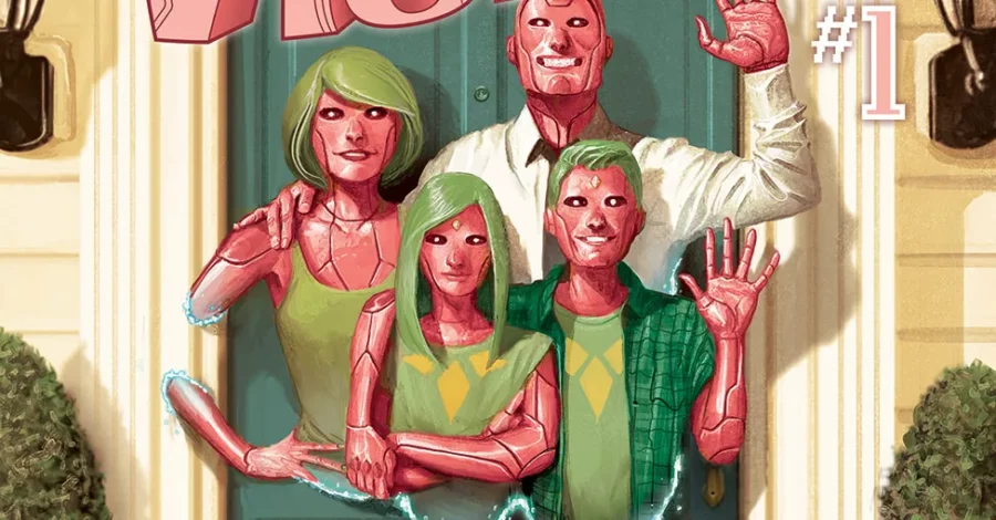
Review: Tom King’s Vision – A Masterpiece of Synthetic Horror Tom King doesn’t just write superhero stories; he writes existential crises. In The Vision, King and artist Gabriel Walta take a character known for being a stoic Avenger and turn him into the lead of a suburban nightmare. If you loved the reality-warping tension of WandaVision or are looking forward to the upcoming Vision Quest series, this comic is the essential blueprint This character was once obscure. Now, he is a household name thanks to the MCU and WandaVision. King’s series explores heavy topics across twelve complex issues. It asks what it truly means to be human. It also examines how we handle family trauma. The Vision Builds a Nuclear Family The premise of this story is simple yet chilling. Vision wants to understand humanity. He also wants to distance himself from his “father,” Ultron. To do this, Vision builds his own family. He creates a wife, Virginia, and two teenage children, Vin and Viv. They live in a house with a white picket fence in Virginia. Vision even takes a job as the Avengers liaison to the White House. He tries to live a normal, suburban life. Every night, the family sits at the dinner table. They do not eat food. Instead, they beam recorded experiences of their day to each other. This attempt at a “normal” life feels intentional and uncomfortable. It is a robotic approximation of human happiness. Trauma and the Catalyst for Chaos Very quickly, a dark event sends their lives spiraling out of control. Tom King uses this catalyst to explore the humanity of these artificial beings. He effectively portrays PTSD in life forms that barely understand feelings. The children begin to change. Vin develops obsessive traits and acts out passages of Shakespeare. Virginia begins repeating words and tells lies to protect her family. These quirks create a fantastic contrast to their robotic behavior. King’s greatest strength is his dialogue. He makes the family seem both cold and logical, yet deeply loving. You will find yourself rooting for the Visions even as they become horrifying. Defining Humanity Through Artificial Life Does a person need flesh and blood to be human? Does a soul require a biological heart? King does not provide easy answers. However, he shows that the Visions are one of the most human families in comics. Virginia lies to protect her children like any human mother. Viv develops a crush on a local boy. She replays the memory of their conversation over and over. She feels things she cannot fully name. The style echoes King’s later work on Mister Miracle. He places boring family life right next to life-or-death superhero drama. If you enjoyed that book, you will love this one. You will feel for this family, but you will also learn to fear them. The Visual Style of Gabriel Walta Gabriel Walta’s artwork is the perfect match for this drama. His panels are big, clear, and very colorful. He makes these robotic characters incredibly emotive. Their facial expressions and body language clearly show the high stakes of the story. The coloring by Jordie Bellaire is equally impressive. The hues are warm during everyday scenes. They switch to cold, desolate tones when the story turns morbid. This shift highlights the loneliness growing within the characters. Michael Walsh takes over the art for issue seven. While a change in artists can be jarring, it works here. This issue is a flashback to Vision’s time with Wanda. The sketchy, cartoon style fits the look of an earlier era. NEW AVENGERS BREAKOUT REVIEW Our Final Verdict on Tom King’s Vision This is a dense book with layers of meaning. You might need to read it twice to catch everything. The story is both sad and hopeful. It is also terrifying. You should definitely read this book. This is especially true if you are a fan of the MCU version. This Vision is more robotic and less empathetic than the movies. However, you will see exactly where the film inspiration started. We give this series full marks. It deserves a spot on every comic fan’s bookshelf. BGCP SUGGESTS: The Vision Collector’s Guide If our review has you ready to enter the suburbs of Arlington, Virginia, here are the best ways to experience this masterpiece and the stories that inspired it. 1. The Definitive Edition: Vision: The Complete Collection 👉 Buy Vision: The Complete Collection on Amazon Why it’s a must-own: This collects all 12 issues of the Eisner Award-winning run. It’s the perfect “one-and-done” graphic novel for your shelf. 2. For the Hardcore Collector: The Visions (Marvel Premier Collection) 👉 Pre-order The Visions Premier Edition on Amazon Why it’s a must-own: Releasing in June 2026, this high-end oversized format features bonus sketches and behind-the-scenes notes from Tom King and Gabriel Walta. 3. The Retro Inspiration: Vision & The Scarlet Witch – The Saga of Wanda and Vision 👉 Buy The Saga of Wanda and Vision on Amazon Why it’s a must-own: See the 1980s “suburban” roots that Tom King subverted. This collection features their wedding and the birth of Billy and Tommy. 4. The Spiritual Successor: Mister Miracle by Tom King 👉 Buy Mister Miracle Deluxe Edition on Amazon Why it’s a must-own: If you loved the trauma-focused writing in The Vision, King’s work on Mister Miracle is the perfect follow-up.

Tom King’s Vision Review: Best Marvel Comic of the Decade? Read More »

planet hulk comic

Is Planet Hulk Actually Good? Our Honest Review Revealed

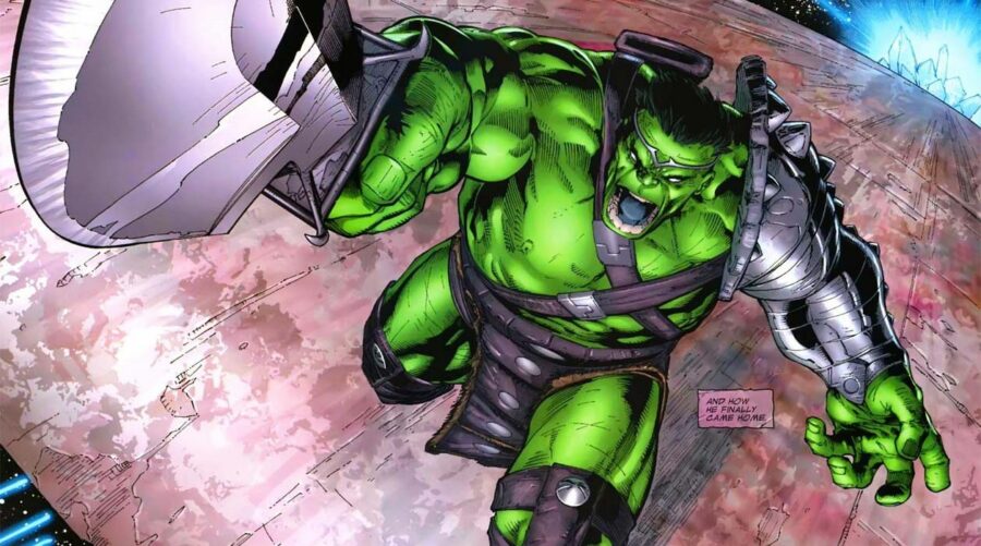
  Planet Hulk Review: 5 Reasons This Marvel Classic is a Slog By Daniel Boyd INTRODUCTION: Revisiting a Marvel Legend Welcome to our Planet Hulk Review. I recently finished re-reading this 2006 epic, and honestly, it felt like a chore. I first read this book in 2013 alongside World War Hulk. At the time, I remember loving it. Many fans consider Greg Pak’s run a highlight for Marvel. Consequently, it often appears on “must-read” lists for new comic geeks. However, revisiting it today changed my mind. I realize now that I was likely looking through rose-tinted glasses. STORY: A Meandering Plot on Sakaar In this Planet Hulk Review, we must address the pacing. The plot meanders and lacks the punch found in other classic Marvel stories. It begins with the Illuminati—including Iron Man and Doctor Strange—sending Hulk into space. While these characters often do shady things, their motives here feel thin and out of character. Once Hulk arrives on Sakaar, the story loses its Marvel identity. It essentially becomes a generic sci-fi comic. Because the plot feels so detached from the main 616 universe, I found it hard to care about the peril. Furthermore, the Hulk is a difficult protagonist to relate to when he is written this way. CHARACTER: When the Hulk Starts Talking I have a confession: I dislike it when the Hulk speaks in articulate sentences. In this story, he strategizes and governs like he studied The Art of War. This makes him feel less like the “Hulk” we know and more like a different character entirely. Some fans argue that this book is merely a setup for World War Hulk. However, 330 pages of setup is simply too much. The narrative drags significantly, making the reading experience feel like a long-distance slog rather than an exciting adventure. ARTWORK: Talent Wasted on a Dull Script? The artwork in the book is decent and consistent. I genuinely enjoyed the pencils by Carlo Pagulayan and Gary Frank. However, I feel the creative team’s talents were wasted on a lackluster script. The inks by Danny Miki and colors by Chris Sotomayor are professional and polished. Yet, much like Jim Lee’s work on All-Star Batman, great art cannot save a flawed story. The visuals are the only thing that kept me turning the pages. VERDICT: The Final Planet Hulk Review Frankly, I wish I had never revisited this book. It let me down and changed my positive memories of the story. If you loved this book years ago, I recommend against re-reading it today. Story: 4/10 Art: 8/10 Overall: A disappointing revisit. Check out our other Marvel reviews: Review – Swamp Thing: The Root of All Evil Review – Watchmen Want to see if you agree? Buy Planet Hulk on Amazon.

Is Planet Hulk Actually Good? Our Honest Review Revealed Read More »

Review – House Of M

Review: House of M (Marvel Comics) – The Day Mutants Died

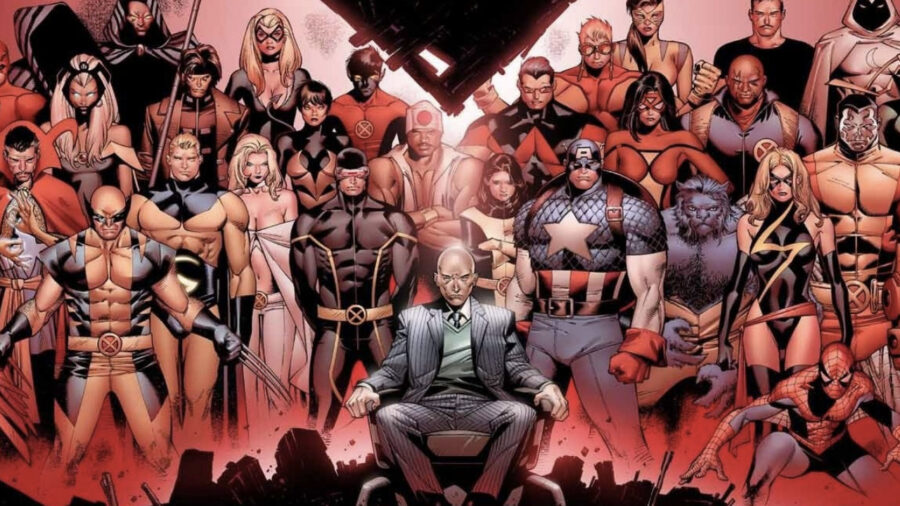
Review: House of M – A World Without Heroes? Publisher: Marvel Comics Writer: Brian Michael Bendis Artist: Olivier Coipel Release Date: June – November 2005 House of M asks a dangerous question. If you could have your heart’s desire, would you take it? Even if it meant living a lie? In this massive 2005 crossover, Brian Michael Bendis explores this existential dilemma. Following the chaos of Avengers: Disassembled, the Avengers and X-Men must decide the fate of the Scarlet Witch. Her breakdown threatens reality itself. But before they can act, the world changes. A Perfect World? The story drops us into an alternate reality. Mutants are the dominant species. Humans are the minority. Everyone has what they always wanted. Peter Parker is a celebrity married to Gwen Stacy. Wolverine is a high-ranking SHIELD agent. Magneto rules the world. Bendis handles this setup brilliantly. He uses the medium to make the reader question their own desires. Would you accept a fake paradise to escape real pain? This concept is fascinating. We see a world where Magneto has won. Yet, in the early panels, he shows striking regret. He repents for dragging his children into his war. This adds depth to a villain who is usually unwavering. Wanda’s Mental State The emotional core of this book is Wanda Maximoff. The slow build-up of her anguish is heartbreaking. She carries the baggage of losing her children and her husband, Vision. Bendis presents these ideas much better here than in Avengers: Disassembled. The execution is less heavy-handed. The narrative flows naturally toward the inevitable conclusion. We know where it is going, but that knowledge makes the journey more somber. The heroes work hard to fix reality, unaware that they are racing toward a tragedy. The Art of Reality Olivier Coipel’s art is a highlight. His pencils capture a phenomenal level of detail. In a story filled with grief, facial expressions matter. Coipel delivers. I also appreciated the costume design. In this alternate universe, the heroes wear different outfits. The attention to detail in these new designs is impressive. It makes the “House of M” world feel lived-in and distinct from the regular Marvel Universe (Earth-616). However, there is one small issue. The cover art often displays costumes that don’t match the interior panels. This is a common issue in comics, but it is distracting here. For a major event from a company like Marvel, you expect better consistency. Why It Matters This story changed everything. It ends with three simple words: “No More Mutants.” This single moment decimated the mutant population. It changed the dynamic of X-Men comics for nearly a decade. Revisiting it now, the stakes feel just as high. It is also fascinating to view this through the lens of the MCU. With WandaVision and Doctor Strange in the Multiverse of Madness, we see live-action adaptations tackling similar themes of grief and reality warping. Final Verdict I am glad I revisited House of M. It remains one of Brian Michael Bendis’ best works. The artwork complements the story perfectly. The themes of PTSD and trauma add weight to the superhero action. There is a reason fans remember this book so fondly. It is arguably one of Marvel’s best crossover events. If you want to understand the modern history of the X-Men, you must read this book. Score: 5/5 More Reviews from BGCP Review: Avengers Disassembled Review: Watchmen

Review: House of M (Marvel Comics) – The Day Mutants Died Read More »

Review – Avengers: Disassembled

Avengers Disassembled Review: How It Changed Marvel Forever

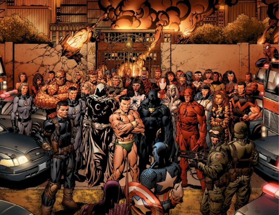
Review: Avengers Disassembled – The Day the Heroes Fell Publisher: Marvel Comics Writer: Brian Michael Bendis Penciller: David Finch Release Date: August 2004 – January 2005 Avengers Disassembled is infamous. Written by Brian Michael Bendis in 2004, this story arc ended the classic Avengers era. It also paved the way for the modern “New Avengers” line up. The story remains controversial. Bendis treats fan-favourite characters with brutal indifference. At the time, this caused an uproar. The repercussions shook the entire Marvel Universe. But does it hold up today? A Controversial Classic I missed this arc when it first dropped in 2004. I finally read the trade paperback ten years later. Perhaps that delay helped me enjoy it more. Fans took the destruction of their heroes personally at the time. With the benefit of hindsight, we can view it through a historical lens. We know where the characters end up. However, the book is far from perfect. I generally enjoy Brian Michael Bendis’ work. I appreciate his goal here. He wanted to strip down a bloated history. He wanted to clear the crowded roster. This allows characters to have fresh starts. It is similar to DC’s Crisis on Infinite Earths, but on a smaller scale. Unfortunately, the execution feels heavy-handed. The intention is rarely subtle. Chaos Erupts I am glad I read the collected edition. If I had waited week-to-week for single issues, I might have quit. The first few chapters offer inexplicable chaos. There is no clear explanation for the madness. However, the main title is “Chaos.” You certainly can’t accuse Marvel of false advertising. Seeing the team thrown into total disarray is fascinating. The Avengers are usually in control. They protect Earth’s citizens with confidence. Seeing them lose that control so quickly is a shock to both the characters and the reader. The problem is the pacing. Crazy events play out consecutively. There is no time to breathe. We never see the heroes process the gravity of their situation. Major characters die, yet the story breezes past them for the next big shock. This makes some of the boldest story beats feel hollow. Not for Beginners A quick word of advice: Do not start here. If you are new to Marvel comics, this is a terrible entry point. I know Marvel’s convoluted continuity well. Even I struggled to follow certain sections of this story. You need a firm grasp of pre-2004 Avengers history to truly understand the impact. The Art: Dark and Gritty I have mixed feelings about the artwork. David Finch’s pencils capture the grand scale of the story brilliantly. He shows the magnitude of destruction perfectly. However, the intimate moments suffer. The way Finch draws faces often feels out of place. It takes away from the emotional gravity of the situation. Frank D’Armata’s colors don’t always help. His style is bright and bold. I think certain scenes needed a muted palette. The garish colours clash with the darker story beats. Issues with Age Revisiting this book in the modern era reveals some flaws. Specifically, the costumes haven’t aged well. This is especially true for the female characters. We have seen shows like The Boys parody the “closet lasciviousness” of comic art. In that light, the impractical leather and spandex designs stick out like a sore thumb. The Highlight The artistic highlight comes in the finale. The surviving Avengers gather to reminisce. We get a beautiful series of two-page spreads. These show a highlight reel of the Avengers’ greatest moments. Different artists draw each flashback. We see Captain America’s revival. We see Wanda and Vision’s wedding. This savvy decision recaptures classic moments for a modern audience. It allows each artist to put their own spin on history. Final Verdict I have given Bendis’ writing a bit of a bashing in this review. Despite that, I still enjoy this book. I can’t fault the unflinching boldness of the writing. It is refreshing to see our favorite heroes out of their depth. This story had to happen. It set up the massive success of New Avengers and House of M. I understand the fan backlash. But I appreciate the guts it took to publish this. If you know your history and want to see the Avengers break, you will enjoy Avengers Disassembled. Score: 4/5

Avengers Disassembled Review: How It Changed Marvel Forever Read More »

Scroll to Top