Comic

BGCP Podcasts and Comic Con


BGCP Comic Con was started as The Big Glasgow Comic Page back in July 2012 mostly out of boredom and trying to find more Comic Fans to speak to, The Scottish Facebook Page gathered likes extremely fast as there wasn’t anything like it at the time and eventually this led to a Comic Book Group, Pub Quizzes, Tournaments and eventually a Comic Book Market  based soley in Glasgow.  We organized BGCP Comic Markets for several years until we had outgrown the smaller venues in Glasgow City Centre so set out to run Comic Cons in and out of Glasgow and further over Scotland including East Kilbride, Rutherglen, Loch Lomond, Dunoon, Aberdeen, Bathgate, Edinburgh, Glenrothes, Kirkcaldy and countless more towns and cities. 

BGCP Comic Con is a series of Scottish Conventions that happen in and around Glasgow, Fife and Aberdeen. BGCP also publish articles, reviews and news.

Previous Convention Guests have included Frank Quitely, Al Ewing, Alan Grant, Gary Erskine, Monty Nero, Yishan Li, David Baillie, Grant Perkins, David Bishop, John Lees, Jim Stewart, Tom Foster and Neil Slorance

We cover Comic Books News, Articles and Reviews from Marvel Comics, DC Comics, Image Comics, IDW Publishing, BOOM Studios, Dark Horse Comics and many more. We also provide the same for movies, television and video games.

Here are some of the main companies and characters that BGCP covers – Marvel Comics, DC Comics, Image Comics, IDW Publishing, Dark Horse Comics, Dynamite, BOOM Studios, 2000AD, Titan Comics, Legendary Comics, Millarworld, Aftershock Comics,Valiant Comics.

BGCP Podcasts

BGCP launched the BGCP:Disassembled Podcast in February 2021 and release weekly episodes featuring the latest comic book news and reviews, we also run weekly interviews and have also featured many writers and writers from Marvel, DC, Image and more.

Review – Invincible: Eight is Enough

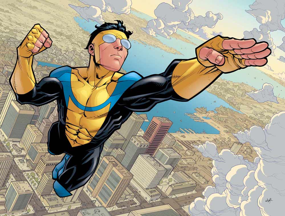
Review – Invincible: Eight is Enough Written by: Robert Kirkman Pencils by: Cory Walker, Ryan Ottley, Matt Roberts, Mark Englert, Dave Johnson, Cliff Rathburn Inks by: Cory Walker, Ryan Ottley, Tony Moore, Erik Larsen, Dave Johnson, Cliff Rathburn Letters by: Robert Kirkman Colors by: Bill Crabtree Release Date: December 12, 2006 Check out our review of Invincible Vol 1 Family Matters here. Introduction If this is your first foray into Invincible, I do recommend going back and reading the first six issues found in Family Matters. It’s a solid origin story that lays the groundwork for the rest of the series. Invincible is a 144 issue long superhero comic series created by Robert Kirkman and Cory Walker, published by Image Comics. Amazon Prime has licensed the comic for an animated series adaptation. Kirkman does a really good job, with Invincible, of writing comics in a way that works not only as stand alone issues, smaller trade paperback chunks, but also as the story overall. He might be the very best at balancing consistent, long form storytelling in the comics medium. Volume 2, Eight is Enough continues the story of our titular hero, as the son of renowned superhero Omni-Man. While continuing with those characters, Eight is Enough begins to broaden the world with more characters and a broader scope. This volume introduces us to Allen the Alien and the Guardians of the Globe, both of which are important going forward. We’re also shown that the book exists in the larger Image Comics universe, with appearances from the likes of Super Patriot and Savage Dragon. Story This second volume is where you really start to see what makes Invincible special. The pacing is still a little slow and it doesn’t feel like a lot happens, just some big things. Even in the first issue though, you start with what seems like a standard slugfest until the characters start asking questions. These subversions of comic book tropes are a hallmark of the book. It ends up being painfully clever and I can’t not appreciate how much care went into writing these moments. Kirkman also starts to show off his skills at sprinkling in little moments that he plans on paying off later. There’s a grounded nature to the series, either in how they handle relationships or small things like not ignoring that a high school kid has homework. The conversations Mark has with his friends feel genuine for kids their age, where they’ll just have a rant about something like shortening names. Much like how in The Walking Dead Kirkman could sell you a zombie comic where you didn’t see zombies for multiple issues, I could read issues with these characters not throwing a single punch. Thankfully they don’t let up on the action that much though.  The Guardians of the Globe are a great parody piece. The small little snippets we get into their lives are pretty entertaining and feel like just the right amount. The twist at the end of Chapter Three gives the book a serious dose of spice and gives the reader endless questions. It’s not that dissimilar from the twist Kirkman delivers in early Walking Dead and defines the book similarly. This is followed up by a lesser cliffhanger at the end of Chapter Four that’s still exciting enough to keep you wondering.  Review – Invincible: Eight is Enough continues below Art If you read the intro in the book, Erik Larsen tells us that Cory Walker was having trouble keeping up with the pace of a monthly book. This leads to some friends coming in to do some guest spots on issue 3. After that Ryan Ottley comes on to do issue 4. So the book gets a decent variety of art to compare. We’re introduced to a lot of fabulous new character designs in this book, from the Guardians, to Allen, to Science Dog, and that’s one of the strongest aspects of the Invincible series, in my opinion. These designs carry into the rest of the series and they help define the world. Review – Invincible: Eight is Enough continues below The guest spots are primarily for The Guardians of the Globe slots and they’re pretty fun. It’s a nice change of pace and gives each of the characters a little extra personality. Cory’s work in the book is better here than in volume 1, particularly when it comes to facial detail. The fight with Allen is really pretty with the space contrast behind them. The design for the attacker from the college campus is inspired and creepy. There’s consistent elements throughout the book, but it’s all kind of average. Ultimately I think you can tell that the pace wasn’t working. The splash pages are great but the smaller panels and quieter moments in the first couple issues do struggle sometimes. All that said, when Ryan joins the book for Chapter Four, it clicks. The book takes on a personality that he will carry forward into the rest of the series. Cory’s designs are crucial for the start of this saga but Ryan’s art fits the book so well and looks so smooth. I think a lot of this goes back to Cory Walker’s comfort level with a monthly title. Ryan Ottley’s work on four comes across like more traditional superhero art. That style works so well for the universe Kirkman and Walker built. Overall Eight is Enough is another solid chunk of story in the Invincible universe. It’s an improvement on the first volume and better in many ways. It’s only four issues, though, and in that it does feel like it does less overall than the first version. It does meander a bit, especially as it stops to introduce us to the Guardians of the Globe. I would have preferred a bit more story in the volume, as far as progress, but the moments we do get are big enough to carry the volume forward.  Out of the 144 issue run, Eight

Review – Invincible: Eight is Enough Read More »

Invincible Vol 1 Family Matters Review: The Best Start 2026

Invincible Vol 1 Family Matters Review: The Best Start 2026

Invincible Vol 1 Family Matters Review: The Ultimate 2026 Starting Point With the launch of Invincible Season 4 on Prime Video, fans are flocking to the source material in record numbers. Our Invincible Vol 1 Family Matters review takes you back to where it all began. Before the blood-soaked battles and multiversal chaos, Robert Kirkman and Cory Walker introduced us to Mark Grayson—a teenager just trying to live up to his father, the legendary Omni-Man. Invincible Vol 1 Family Matters Review: Does it Hold Up in 2026? In this Invincible Vol 1 Family Matters review, we look at why this first trade paperback remains the “Gold Standard” for superhero origin stories. While many modern comics try to reinvent the wheel, Family Matters succeeds by perfecting the classic tropes of the Silver Age and giving them a modern, subversive twist. The Story: A Teenage Hero’s Awakening The narrative follows Mark Grayson, an average high schooler who has spent his life waiting for his Viltrumite powers to kick in. When they finally do, the story moves at a breakneck pace. From choosing his iconic yellow and blue suit to his first encounter with Allen the Alien, Family Matters expertly balances high-stakes action with relatable family drama. The Art: Cory Walker’s Clean Aesthetic While later volumes feature the hyper-violent detail of Ryan Ottley, the original Invincible Vol 1 art by Cory Walker is essential. His clean lines and vibrant colors give the world an optimistic, almost Saturday-morning-cartoon feel—which makes the dark turns in later volumes hit even harder. Invincible Vol 1: Pros and Cons for Show Fans If you are coming to the comics after watching the Invincible Season 3 finale, here is what you need to know about Volume 1. The Pros The Cons Final Verdict: Is Invincible Family Matters Still Essential? Our Invincible Vol 1 Family Matters review gives this book a definitive thumbs up. It is the perfect entry point for anyone looking to see why Invincible is called “The Best Superhero Comic in the Universe.” Whether you’re a collector or a casual fan of the show, this is where the journey to the top of the mountain begins. Final Score: 8.5/10 – A Modern Classic. Invincible Month 2026: Best Comics & Gear Celebrate Invincible Month with these top-rated items from Amazon UK:

Invincible Vol 1 Family Matters Review: The Best Start 2026 Read More »

Review: Earth-One: Wonder Woman Vol 3

Review: Earth-One: Wonder Woman Vol 3 Story: Grant Morrison Att: Yanick Paquette Colours: Nathan Fairbairn Covers: Yanick Paquette, Nathan Fairbairn Released: March 2021 Introduction This concludes the critically acclaimed story arc unique writer Grant Morrison (Doom Patrol, Animal man etc..) crazily brought to Wonder Woman. Gloriously proud, fantastically feminine and here to take down the boring patriocracy with Girl (or should I say Woman power!) After the death of Hippolyta at the hand of Paula Von Gunther, Diane must lead her people against the forces of men both today and a thousand years in the future. So let’s grab our tiara and lasso of truth, put on our knee-high red boots and start the review of Wonder Woman Earth-One’s triumphant final Volume! Jumping between the future and current timelines we find the world is a Paradise, all war eradicated and all genders and sexualities proudly working for the greater good of the world. But watch out! Let’s cut to the past and the evil Maxwell Lord who wants to bring the war to the Amazons using his A.R.E.S. mark 1 suits (corny but subtle clue Mr Morrison!) These mecha-men won’t stand for this and have had enough of women protesting and complaining about harassment. Can Steve break out of prison? Can Diana unite the tribes of Amazon women? Will there be death by Snu-Snu? Why is the queen’s heart still burning? And will I stop asking questions and get on with this review..? All the answers are in this issue….and a few you didn’t even think of If you are going to end on a high why not have Diana riding a giant kangaroo while an army of cold unfeeling menbots descends on the Amazons to stop their very way of life?     Story/Writing As with the previous two volumes, Grant’s vision of Earth One’s Diana is stunning with the story jumping from the pages into your imagination. You find yourself flicking back a few pages in case you missed a text bubble or two. This finally is Diana triumphant, ruling her people and bringing peace, love and equality to the world whether men want it or not!  Men have not bargained on her using the ultimate threat! All women will withhold sex if men do not succumb… Death by no Snu-Snu? I can imagine Grant smiling as he finished this novel and then dedicated it to his sister Leigh. If you are going to write a bonkers battle of the sexes, this is how you do it! I doff my cap to Mr Morrison! Art/Visuals Yanick’s art style is perfect for this we move from fairy wings and female empowerment motifs to the stern, cold world of men where Maxwell Lord sits on a symbolic throne watching and directing the action. The fight sequences are great, sometimes a little confusing with the armies of Amazons and Robots hard to distinguish key characters. But if that is my only complaint it is a small one and I’ve already read it twice now from cover to cover!Some of the images such as the cover are a homage to great works of art depicting strong women and anything that can get kids excited about art is worth it! Overall thoughts This could drift have drifted into a lecture on female empowerment. Instead, Grant and Yanick skillfully handle the current drive to strengthen female characters beyond the bosoms and bodices that the industry is far too guilty of. From me the father of a strong, proud daughter and husband to an even stronger wife there needs to be more of this type of book. My only slight criticism of this is that there still seems to be a small amount of Body Dysmorphia represented here with traditional tight revealing outfits and standard gravity-defying huge chests on most females. So let’s finish this review of Wonder Woman triumphant legacy and allow you to grab your significant other! Buy a copy at your Local Comic Book Shop, brew a tea and cuddle up to the joyous conclusion to one of the freshest titles to come from the Earth-One universe. If you enjoyed our Review of Earth-One: Wonder Woman Vol 3 then comment below or leave your own rating below. Join us on Discord, Instagram, Twitter etc – linktr.ee/BGCPComicCon [yasr_multiset setid=1] [yasr_visitor_multiset setid=1] Buy tickets for BGCP Comic-Con in and around Glasgow Scotland – BUY TICKETS Check out all of our Comic, Movie, Television and Videogame Reviews HERE and our Podcasts/Interviews HERE

Review: Earth-One: Wonder Woman Vol 3 Read More »

Review - The Amazing Spider-Man 2 (video game)

Review – The Amazing Spider-Man 2 (video game)

Review – The Amazing Spider-Man 2 (video game) Developer: Beenox Publisher: Activision Genre: Action-Adventure Writer: Christos Gage Release Date: April 17th 2014 You are probably thinking Dan, why the hell are you putting out a review of The Amazing Spider-Man 2 video game in 2021? It was a poorly reviewed movie tie-in game that came out seven years ago. That is a very valid question. I chose to go back and review The Amazing Spider-Man 2 video game because I actually believe it is one of the most relevant games I have ever played in terms of the wider gaming landscape. So yeah you may have me rumbled, this won’t be so much a review of The Amazing Spiderman 2 for PS4 as it will be a commentary on bad games in general and their place in the modern gaming landscape. I first played this game about three years after its initial release; picking it up cheap in an era that was dominated by Rocksteady’s Batman Arkham games. I remember that I had just come off of finally getting around to playing Until Dawn after putting it off for a long time. Until Dawn is a well made, well written, well acted, well executed teen horror story that had atmosphere and intrigue in spades. I then went on to play a game that I thought was mediocre by comparison, DMC Definitive Edition. When playing through the story I remember being so underwhelmed and disappointed in what they had turned this once great franchise into; an angsty, melodramatic, arcade slash ‘em up with as much depth as the shallow end of the kiddies swimming pool. I remember thinking, what a waste of cash and time. What a piece of garbage. Oh how naïve I was, as I had no idea how much worse it could get. The first thing that I was painfully reminded of upon revisiting The Amazing Spider-Man 2, was that this game graphically is at the same level if not worse than the first Amazing Spiderman game that was first released back on PS3. In 2021, after playing Insomniac’s 2018 Spider-Man game it is even more pitiful to look at than it was at the time. However, games with under par graphics can still be fun and UI’s and poly counts aren’t everything, So I began working my way through the game. Let’s start with the only positive that this game has going for it, the web slinging. Traversal feels and looks great in the game, zipping around NYC is a treat and when everything works correctly, you can pull off some truly spectacular acrobatics while shooting around in mid air. The shoulder buttons on the controller are matched to Spidey’s arms, left trigger for left swing, right trigger for right swing, and unlike the first Amazing Spiderman game, in this one the web shooters have to be aimed at a building in order to perform a successful swing. The important phrase here, is ‘when it works.’ There were several times when I would be right next to a building and press the trigger to swing, only to hear Spidey say, ‘Hey, this just in, web slingers need something to stick to.’ I realise that Spidey, that’s why I’m pressing the trigger on the side where the huge goddamn skyscraper is. Also, there would be times when I had a decent amount of momentum going, swing left, right, left, right consecutively and as I pressed the left trigger again to attach to the building on my left. Then, for some odd reason, Spidey would fire his right hand web shooter, attaching to a distant building on the right. Thus, turning me away from the direction I was swinging and totally ruining my momentum. This was particularly frustrating during boss fights and chase sequences or when swinging against the clock. Still though traversal is fun, – it is not a patch on Spider-Man 2018, but it still holds up fairly well. Now that the game’s one positive is out of the way, let’s rip this thing apart. Animations are stiff, glitches are common and every cutscene in the game ends abruptly with an awkward animation that resembles the look of a news anchor when they run out of words to read off the teleprompter, but the camera is still rolling. I have no idea why they decided to add a dialogue system, it is so unnecessary and out of place and has absolutely no effect on the outcome of the game’s narrative. It was simply included just for the sake of having a dialogue option. The plot is fairly standard, but is bearable for the first two thirds of the game, however the point that the publishers told the development team to get a move on and meet the deadline to coincide with the release of the movie becomes instantly clear. The last 5 or so chapters in the game are so rushed it’s like going through a checklist. The first bossfight in the last third of the game is pretty mundane, but at least there is an attempt at a build up to it. However after that fight you are teleported to the top of a skyscraper to battle Electro in a boss fight with the least build up in any game ever developed. So you do that and then you are corrected, this next boss fight with the Green Goblin is the least build up to a boss fight in any game ever developed. You don’t see the transformation of either Electro or the Goblin and honestly, if I hadn’t seen the movie that goes with this game, I would not have had a clue about what was going on. Then it’s as if the game remembers that they made a half cocked attempt at introducing Carnage away back at the beginning of the story and so they throw in another out of the blue boss fight to end the game. This lack of story build

Review – The Amazing Spider-Man 2 (video game) Read More »

Review – Scarlet Witch Vol 1: Witches’ Road

Review – Scarlet Witch Vol 1: Witches’ Road Publisher: Marvel Writer: James Robinson Art: Vanesa Del Rey, Marco Rudy, Steve Dillon, Chris Visions, Javier Pulido, Jordie Bellaire, Frank Martin, Vero Gandini, and Muntsa Vicente Release Dates: 2015 – 2017 Scarlet Witch has taken the world by storm these last few weeks thanks to WandaVision. Fans of her literary and live action appearances are very aware that daughter of Magneto is not perfect. She is one of the most powerful beings in the Marvel Universe. She can rewrite reality with a single thought; however, she cannot control everything or everyone around her. Wanda Maximoff has committed unspeakable acts that changed the world forever. She carries guilt for those acts to this day, but must push it aside to face a looming threat. Enter the Scarlet Witch. Story Scarlet Witch Vol:1 Witches’ Road follows Wanda Maximoff’s return to fighting evil. But instead of facing purple-skinned tyrants and her technical father-in-law Ultron, she faces a silent threat. A “broken” magic is surrounding the world. Dark forces are forming at work, and old villains vie to become our hero’s new rival. The world may not want the Scarlet Witch, but she is the best they got. The five issues together follow Wanda’s trek to confront the witchcraft that permeates the globe. However, each issue can be treated as a stand-alone story as each issue puts Wanda to a completely different location and in touch with completely different people. This is what makes Scarlet Witch Vol: 1’s such a fantastic read; James Robinson gives his readers a story wherein Wanda is constantly confronting herself and the forces working against her. But by approaching the story as a loosely tethered anthology of short stories, Robinson adequately toes the line between lore-building and having fun with Wanda’s character by placing her in ever-changing circumstances. This philosophy of giving readers short stories with a beginning, middle, and end is descriptive of Scarlet Witch Vol: 1 as a whole. Previous knowledge of the Scarlet is not required. The story provides you everything you need from the get-go, and it is not a lot: Wanda Maximoff is Scarlet Witch; she has a disembodied mentor called Agatha Harkness; Wanda is living with the sins of her past and she is ready to atone for them. Readers who find their way to the end of the volume are invited to continue journeying with Wanda into Volume 2, yet Robinson’s cohesive storytelling also allows readers to stop their journey at the final page, satisfied with what they read. Art The absolute best thing about Scarlet Witch Vol: 1 is the art. Every issue contains a different illustrator’s art. Each artist uses light, shadow, color, dimension, shapes, and even panels differently. However, none are bad; in fact, it is very difficult to pick out which is best as this will depend on the reader’s preferences. This shotgun approach of having different illustrators illustrate their own issue of a 5-issue arc serves two accomplishments: 1) First, it resonates with Robinson’s loose-anthology approach to Scarlet Witch Volume: 1 in that each issue can be treated as its own short story. 2) Second, it gives readers of different artistic preferences something to like. If a reader did not like the overuse of darkness in issue #1, that’s fine because more than likely that reader will like the bright colors of issue #5. Everyone will like something. While this shotgun approach is risky for sacrificing artistic consistency, I believe the risk was well worth it as each illustrator is no doubt talented in their given style. Scarlet Witch Volume: 1 Witches’ Road is a cohesive, fun story comprised of smaller cohesive, fun stories. Scarlet Witch fans will watch Wanda grow beyond the sins of her past. New fans who only know Wanda from the MCU will be treated to a fun time and may come to respect her comic book counterpart. Come for the Scarlet Witch; stay for the eye-catching artwork. If you enjoyed our Review of Scarlet Witch Vol 1: Witches’ Road then leave a comment or rating below. Join us on Discord, Twitter, Instagram etc – linktr.ee/BGCPComicCon [yasr_multiset setid=1] [yasr_visitor_multiset setid=1] Buy tickets for BGCP Comic Con in and around Glasgow Scotland – BUY TICKETS Check out all of our Comic, Movie, Television and Videogame Reviews HERE and our Podcasts/Interviews HERE

Review – Scarlet Witch Vol 1: Witches’ Road Read More »

Review – Suicide Squad #1

Review – Suicide Squad #1 Publisher: DC Comics Writer: Robbie Thompson Artist: Eduardo Pansica Inker: Julio Ferreira Colorist: Marcelo Maiolo Letterist: Wes Abbott Release Date: March 2021 Let’s Begin: Ever since the feature film released in 2016, The Suicide Squad has changed into a completely new beast. The past 5 years has (for better or worse) been a unique half-decade for the team becoming more mainstream and emphasizing the importance of many crucial members of the team. Clearly, the series about a group of expendable D-list villains forced to work together on a covert black ops mission without knowing who would live or die at any moment had changed into something new. While Amanda Waller was still calling the shots, the members of the team seemed to become less and less expendable as they cemented themselves as permanent members of the team who were mainstream characters in the DC universe. Unlike the original conception of the series, there are clearly some characters that are untouchable. Everyone knows that Harley Quinn is going to make it to the end of the series…whether this is a negative thing or not depends on who you ask. However, one thing is for certain; The Suicide Squad has been something different. With a brand new movie by James Gunn coming this year, the Suicide Squad has the potential to enter a brand new era, and Robbie Thompson is looking to help make that happen. Guess Who’s Back: Waller’s back. And much to the dismay of Rick Flag, she has a crazy plan to turn the Suicide Squad into it’s most absolute form, Task Force Z. Amanda Waller sends Peacemaker and a few other obscure villains like Film Freak (yes, Film Freak) on a mission in Arkham Asylum to retrieve William Cobb, the Talon himself. While the Squad makes light work of the officers guarding the Asylum, Talon himself proves to be enough of a challenge on his own, as he seems to have forgotten who he is and is immediately hostile toward the team. Meanwhile, Rick Flag is clearly not a big fan of Waller’s secret plan, but Amanda isn’t having it so she electrocutes him and throws him in chains. It quickly becomes clear though that Flag isn’t the only one Waller has locked away, and the chains on this surprise prisoner definitely aren’t gonna be staying on for long. As we cut back to the Squad in Arkham Asylum, each member is dispatched one after the other by a release of Joker gas in the vicinity and the overflow of expendable guards trying to subdue them until only 2 remained. With Peacemaker and Talon retreating up flights of stairs with Asylum guards gaining from below and green toxins filling their only escape route, the two prepare to fight off the horde of officers quickly approaching as the issue comes to a close. Not Here To Show Off: The art in this book done by Eduardo Pansica is very good. The style complements the action focused storytelling by providing dynamic scenes that show the ability of the characters skills. The obscure villains utilized within are made to look powerful and cool despite their obscurity and quirkiness. The characters specifically are drawn with great detail and full page spreads are done very well. Overall, this is a clean art style for such a muddy and murky cast of characters. Some Kind Of Suicide Squad: Ultimately, this new Suicide Squad team is refreshing and intriguing enough to warrant your attention. I wasn’t going into this issue with much of any expectations, but this new set of squad members and whatever Waller has planned got me invested enough to want to continue reading the series. All of the characters seem like unique and sensible fits for the Squad with Peacemaker and Talon specifically peaking my interest to see where these characters are taken. The lack of any mainstay Suicide Squad members may throw off some fans of the series, but I think that is exactly what this series needed. The uniqueness of this story in comparison to recent storylines gives it a sense of unpredictability that a title like the Suicide Squad greatly benefits from. Every aspect of this issue seems to give off a unique energy different than what this title has had before. This year seems to be a big one for the Suicide Squad, and if you are looking forward to the upcoming movie or looking for a unique new title, this is a really solid first issue that should at least warrant picking up the next issue to see what happens next. [yasr_visitor_multiset setid=1] [yasr_multiset setid=1] Please don’t hesitate to leave a comment down below for our Review of Suicide Squad #1 and give us your rating of the comic if you’ve also read it. Join us on Discord, Instagram, Twitter etc – linktr.ee/BGCPComicCon Buy tickets for BGCP Comic Con in and around Glasgow Scotland – BUY TICKETS Check out all of our Comic, Movie, Television and Videogame Reviews HERE and our Podcasts/Interviews HERE

Review – Suicide Squad #1 Read More »

Review – Harley Quinn Vol. 1

Review –  Harley Quinn Vol. 1: Harley vs Apokolips Publisher: DC Comics Writers: Sam Humphries & Christopher Sebela Art:John Timms/Alisson BorgesMirka Andolfo/Max Raynor Colouring: Gabe Eltaeb Cover Artists: Guillem March & Tomeu Morey Release Date: 05 Dec 2018 “Harley Quinn is Back, Baby!” All Harley wanted was a dang vacation. Just some nice quiet “me time” in the small island country of Badhnisia, situated in the South China Sea. Sun, sea, sand and sanity. Is it too much to ask? Apparently, it is. Whisked to the scariest place in the known universe, Apokolips. Harley is given an offer she cannot refuse: join the Female Furies, get kick-ass powers and wreak havoc! This may very well turn out to be the best vacation ever. Tasked by Granny Goodness, Harley along with her new superpowers, must hunt down a rogue Fury by the name of Petite Tina. Sounds easy, right? Oh boy… this is a Harley Quinn story we’re talking about. Nothing is EVER easy. Turns out Petite Tina isn’t as “tiny” as her name suggests. Y’know what though? She’s a pretty sweet gal, despite being a soldier bred in the pits of Apokolips. Harley has a dilemma on her hands, take down Tina and hand her over to Granny Goodness or face the wrath of the Furies. Choices, choices. Harley Quinn Vol. 1: Harley vs Apokolips is the start of a new era for one of the most popular characters in comics. Collecting Harley Quinn #43-49, this series is packed with the Quinn craziness we all know and love, plus with tighter ties to the DC Universe. “Our Little Harley” To say I am a fan of Harley Quinn would be a bit of an understatement. I adore Harley Quinn. So, when this popped up to review I jumped at the chance. Issues 45 to 49 were fun to read. However, I struggled a little with Issues 43 and 44. Forty Nine connects perfectly to the last four issues as upon Harley’s return to Earth, she finds out her hideout/home is days away from being demolished and turned into condos. I understood that, and I enjoyed it. Forty Three and Forty Four is where I struggled. Taking place before Harley’s adventures in Apokolips, it sees her trying to figure out who is out to kill her. There was just one slight snag, it was all in her head. As a reader, following this, the story felt like a drag. Now, don’t get me wrong, Harley Quinn has forever been a kooky character. Much like Deadpool, she knows she’s part of a comic book so essentially “talks” to the reader. This is fun, this engages us as the reader. The problem is, and I’m unsure if this was intentional or perhaps just my version, but #43 and 44 were after #45-49 in the running order. I hadn’t noticed this the first time round, but upon looking back as I write this, they’re at the tale end. There’s even a little note from the comic’s editor saying it takes place before Apokolips, making the reader think perhaps this is a flashback. According to the run number, it is not. They are #43 and 44. Why they were placed at the back of the book I haven’t the foggiest. “Harley Love in Save The Last Dance” Despite this little snag, I really did enjoy the comic. Sam Humphries and Christopher Sebela certainly did justice to who Harley is as a person. She is constantly conflicted by wanting to do the right thing but, ultimately, all she wants to do is have fun. Harley can easily be swayed, especially by bad guys like Granny Goodness. She also has a child-like quality about her. John Timms, Alisson Borges, Mirka Andolfo, and Max Raynor are to be thanked for the art, which is genuinely beautiful. Touched up by Gabe Eltaeb’s colours, each page was just lovely to look at. I’d also like to give a shout-out to letterer, Dave Sharpe! If he’s the one who added all the colourful text to nuance what characters were saying, I doff tip my hat to thee! Very much 60’s style Batman. I honestly wanted a “ka-pow” to appear and then for there to be a break with Harley’s face circling in and out. There was also two little, old style comic pages within the novel itself that were akin to “Dennis the Menace” and “Archie” which I found lovely. They both credit an artist known simply as “M. Clatterbuck.” Upon researching, it appears that this mysterious artist has a bigger picture to play within the DC Universe. Hopefully I’ll be lucky enough to get a chance to read Harley Quinn #50 to find out. “Game Over” Overall, this comic was a wonderful journey from beginning to end despite the (possible) mishap of jumbled up issues. For anyone who is a Harley Quinn fan, if you haven’t already added this to your collection then I’d do so now! Ms. Quinn will forever by my favourite DC character and I can’t wait to read some more of her crazy adventures. Have you read this series? If so, tell us your thoughts below as well as give your own rating. You can also read about Harley’s ol’ Puddin himself, The Joker, here and here.

Review – Harley Quinn Vol. 1 Read More »

Review – God of War: Fallen God #1

Review – God of War: Fallen God #1 Publisher: Dark Horse Comics Writer: Chris Roberson Artist: Tony Parker Colourist: Dan Jackson Letterer: Jimmy Betancourt Release Date: March 2021 I loved the recent God of War game on PS4, so I was eager to read #1 of God of War: Fallen God for review. The book is intended to fill in the gap following God of War 3, which saw Kratos kill the last of the Greek gods, ending with Zeus. When we pick back up with the Ghost of Sparta in God of War 2018, he is now in Midgard and battling gods and deities from Norse mythology. The Fallen God series is intended to fill the audience in on how exactly Kratos got from Olympus to Midgard. This first issue picks up shortly after the end of God of War 3 and the first half of the issue sees Kratos attempting to get rid of his Blades of Chaos to no avail. They seem to have an omnipresent hold over him and follow him wherever he goes. It works as a fairly blatant personification of his past not letting him go and constantly catching up with him. The second half of the issue follows Kratos getting further and further away from Mount Olympus and starting to hallucinate due to a lack of rest. These hallucinations consist of animals speaking to him in order to remind him that he can’t outrun destiny. This carries on until a shattered Kratos finally collapses at the end of the issue. This isn’t a first issue that contains a lot of action; in fact it contains no real action scenes whatsoever. I understand that the writers are attempting to take Kratos from the impulsive, super angry dude that we followed in the first three God of War games to the more contemplative, sombre version we see in God of War 2018. However, the idea that he goes immediately from an action packed god-killing adventure directly into this slow travellers tale is somewhat of an anti-climax. I don’t mind a slow burn, but when you’ve just come directly from the exciting climactic cutscene and the end of God of War 3 and go straight into this, it’s a fairly big step down. I was expecting to see a more violent Kratos in the first few issues that would slowly turn into the more circumspect and mature version of the character we see in God of War 2018. Instead Chris Roberson delivers a weird disconnect from the way that the character was written in the game that took place immediately before this issue chronologically. Also, a first issue is supposed to grab new readers and get them excited and onboard for what’s to come. A slow actionless issue such as this usually comes at around issue 4 or 5. Starting the series off with a slow-paced issue like this isn’t a great way to get new fans onboard. Additionally, if anyone happens to pick up this book that doesn’t happen to already be familiar with God of War lore, then all that you are going to take away from this is a boring 20 pages of a guy wandering the desert and slowly going mad. The art is decent though, Tony Parker’s pencils and inks manage to capture the look and feel of the landscapes that we see in the earlier God of War games and Kratos is drawn accurately as well. There aren’t any stand out pages that come to mind that really left me awestruck though, but every panel is perfectly serviceable. The colours are nice enough and the lettering is decent but again, nothing mind-blowing. Overall, I am pretty disappointed after reading the first issue of God of War: Fallen God for review. Not enough engaging elements are present to really hook the reader. It takes a lot to make a character like Kratos boring, yet somehow Chris Roberson has managed it here. This is one to skip whether you are a God of War aficionado or not, hopefully the series will pick up a bit as it progresses.

Review – God of War: Fallen God #1 Read More »

Review – Pride of Baghdad

Review – Pride of Baghdad Written by: Brian K Vaughan Art by: Niko Henrichon Lettered by: Todd Klein Release Date: September 2006 Introduction Pride of Baghdad is a Vertigo title by Brian K Vaughan and Niko Henrichon. Niko is known for a lot of cover work for Marvel and DC. BKV is known for his work on Lost, Saga, and Y The Last man, among other titles. Published in the mid-2000s, Pride of Baghdad came out at a time when the Vertigo logo was almost always a sign of a fantastic book. Pride of Baghdad was printed as a complete volume, as opposed to the more traditional serialized format. The creators based Pride of Baghdad on a true story of lions who escaped the Baghdad Zoo during the Iraq War in 2003, specifically an American bombing during the Fall of Baghdad. While initially rooted in truth, the story told about these four lions is ultimately a fictionalized story of four anthropomorphized lions. A beautiful book, Pride of Baghdad offers us a rare setting and a unique story. Review – Pride of Baghdad continues below Story The story is simple, our four lions leave the zoo after the bombing and explore their freedom. Our lead characters and their interactions with the world are where the writing shines. You’re offered a variety of perspectives and personality types. Each member of the pride stands out, from the hopeful revolutionary, to the jaded elder looking to live out their days peacefully. The group really feels like a family that has lived together for a while too. I’m always a little skeptical when folks write with anthropomorphic characters. It’s important that we remember how brutal nature can be. Pride of Baghdad balances that very well. It’s obviously a story written by humans but it doesn’t humanize every aspect of nature. The mating rituals of lions are portrayed as normal for them, but with just enough human sadness. They ultimately act more like animals than humans, and that’s the key.  On its surface the writing can be enjoyed as a family of animals trying to survive, or you can look beneath the layers to mine the interesting ideas. It also wasn’t until my second or third read that I truly understood the allegory. At first I thought Pride of Baghdad was just about discussing zoos, and missed the deeper discussion. This made me like the book even more. Even then, the perspectives are balanced and the story doesn’t tell you how to feel, it just offers questions. The journey is thoughtful and the ending poignant. The book gives you so much to think about, if you want it. However, it’s subtle enough that you don’t feel bludgeoned if you just want to read a pretty book. Art The highest compliment I can pay to this gorgeous artwork is that you could pull all of the speech bubbles from the comic and it would still be an incredible read. Pride of Baghdad is a book where every page is used to tell the story and the art carries so much of that story. Even the pages used for credits or to end the book lend themselves to the story in subtle ways.  The artist really balances the natural look of the animals with just enough humanized emoting that you can follow their feelings. It’s a tricky balance to pull off but Niko nails it. They’re given just enough emotion that you can read the book without dialogue and still understand them. Fajer is, perhaps, the most exaggerated of the animals, but you look past it because he’s just terrifying to look at and it works.  The art in Pride of Baghdad leans on reds, yellows, and oranges, which works given its locale, but it never feels same-y. There’s a depth to the use of color that I find irresistible. On its surface I don’t think to call the book colorful but flipping through the pages you realize just how rich and diverse the colors are. In the wrong hands you could see someone trying to make the art look more cartoony. Overall I did review The Deluxe Edition, so it’s worth mentioning the additional content. If you like this book, the deluxe edition is worth it. I would buy an Absolute of this, if I could. In the Deluxe Edition, you get a bunch of early text and artwork for the book, which is a nice bonus. They printed the proposal for the book, and an outline, which gives some interesting insight to the writing process. There’s lots of sketch and pencil work to comb through, too, if you’re as fascinated by the process of drawing animals as I am. It might sound like I’m in love with this book, and that’s because I am. It’s a perfect book, in my eyes. Pride of Baghdad truly shows the potential of comics. It’s one of those books you give to people who are unfamiliar with comics. I’ve handed it off to many folks who want to try reading comics, but I know they wouldn’t respond to standard fare. It’s also often the first book I hand off to expose someone to Brian K Vaughn for the first time. Pride of Baghdad is a story that belongs in comics and lends itself to the art form. There’s no need to see it adapted or transformed. It’s mature without being explicit, and serious while still being entertaining. The art is gorgeous and the pacing is perfect. The ending is brutal, poignant, and appropriate for the setting. When I say that, I mean both the end of the story of the Pride, as well as the final words of the book. “There were other casualties as well.” Every time I finish Pride of Baghdad, my eyes burn a little. It’s a book I’ll never forget and can’t recommend enough. If you enjoyed our review of Pride of Baghdad then leave a comment or leave your own rating below.

Review – Pride of Baghdad Read More »

Review – Batman: The Doom That Came To Gotham

Review – Batman: The Doom That Came To Gotham Publisher: DC Comics Writer: Mike Mignola & Richard Pace Penciller: Troy Nixey Inker: Dennis Janke Colourist: Dave Stewart Letterer: Bill Oakley Release Date: November 2000 – January 2001 I was looking forward to reading Batman: The Doom That Came to Gotham for review, as it is an Elseworlds story that I had been meaning to get around to reading for a while now. It is written by the brilliant mind that created Hellboy and it mixes Batman lore with the themes of H.P Lovecraft, – what’s not to love? This should have been an easy homerun success for DC, but unfortunately it is not. The plot sets up Bruce Wayne as an explorer, sailing his ship across the seas for the last 20 years with the Robins as his shipmates, he then returns to a 1920’s themed Gotham City. I actually enjoyed the eerie setup that the first few pages of the book delivers, unfortunately this is the plot’s high point. As soon as Bruce appears as Batman, the story seems to lose its way. The setup for why Bruce dresses as a bat is clumsy and unclear, much like the portrayal we get of Batman throughout this book. He is sloppy and carries a gun, which he never even uses to any actual effect. He also never feels competent in any given situation, instead it just feels like he happens to be in the right spot at the right time during action sequences or we would have easily been killed. He spends this whole book getting lucky and scraping victory through no real doing of his own. In terms of the dialogue, my God this is a boring Batman! He says nothing of any real interest through the whole book and has the personality of a wooden board. The dialogue in general is largely expositional and never seems to flow naturally, instead feeling shoehorned in. After the opening act of Wayne coming back to Gotham, the rest of the book seems to drag on a fair bit before anything else happens of any great significance. To the point that it took me several sittings to even get through the book and honestly, if I didn’t have to finish reading through it for the sake of this review, I would have put it down and moved onto something else more engaging. It also doesn’t help in terms of focus that so many flashbacks and cryptic metaphors are used throughout the story. I realise that these techniques may have been employed to pay homage to the Lovecraftian style that this book is clearly going for. However, there is an extended flashback sequence that takes place from page 106 to page 114 that feels very aimless and frankly unnecessary to the plot. One glimpse of hope was when (SPOILER) Jason Todd and Dick Grayson are unceremoniously killed and it seems like one positive of this book is that it doesn’t need to adhere to regular continuity, so no one is safe. Afterwards I was eager to see Bruce’s reaction to finding out that two of his crewmates and adopted sons are dead but instead of seeing any significant grief or loss from Bruce, we instead get one page that shows a couple of frames of him saying goodbye to the Robins at their graveside. It feels like Bruce takes their death rather lightly and nonchalantly fails to bring them up again through the entire rest of the book. Frankly, the artwork in this book is hard to look at, – and not in the right ways. Upon seeing the first few panels, I thought it was interesting that they had chosen not to make Bruce Wayne as traditionally handsome as he is usually drawn. Then I got a few more pages in and realised that all of the faces are drawn to be extremely ugly and hard to look at. I don’t know if that is because Troy Nixey struggles with drawing faces as I am not aware of his other work, or if it is a stylistic choice, or if it is because they were very obviously trying to recreate the style of Mike Mignola. Regardless of the reason for this, it is extremely noticeable and distracting as you are reading through the book. I also hated the design of the Batsuit in this story. The Batsuit is supposed to be menacing and strike fear into criminals, the suit seen in this story isn’t menacing in the slightest. It looks baggy and too big for Bruce to fill it out, this makes Batman look pretty weak and wimpy, especially when paired with the fact that he has to carry a gun to defend himself. Just when you start to get over how pathetic and unthreatening Batman looks in this story, the book manages to one-up itself in terms of ludicrous absurdity. When Batman goes to the graveside of the two dead Robins, he is wearing his full Batsuit in broad daylight, with a trench coat over the top of it. It is genuinely one of the most laughably ridiculous things I’ve ever seen in a Batman comic and that is really saying something. I also found the book’s final battle to be a confusing mess narratively and the art really didn’t help matters. The weird environmental artwork, mixed with the off-putting character design of the literal Bat-Man that Bruce turns into, along with the weird colour choices just makes the whole thing a nightmare to look at. It results in the reader having a difficult time following the action and ends up just being a cluttered panel of awkward characters designs. Overall, I came away pretty disappointed after reading Batman: The Doom That Came to Gotham for review. It does not live up to the pedigree of Mike Mignola or the literary influencers that it clearly borrows from. This book could have been great, but sadly it is one to skip

Review – Batman: The Doom That Came To Gotham Read More »

Scroll to Top